
 免费 AI IDE

微信小程序表单组件输入框 input
2022-05-11 16:07 更新
input
基础库 1.0.0 开始支持,低版本需做兼容处理。
输入框。该组件是原生组件,使用时请注意相关限制
| 属性 | 类型 | 默认值 | 必填 | 说明 | 最低版本 |
|---|---|---|---|---|---|
| value | string | 是 | 输入框的初始内容 | 1.0.0 | |
| type | string | text | 否 | input 的类型 | 1.0.0 |
| password | boolean | false | 否 | 是否是密码类型 | 1.0.0 |
| placeholder | string | 是 | 输入框为空时占位符 | 1.0.0 | |
| placeholder-style | string | 是 | 指定 placeholder 的样式 | 1.0.0 | |
| placeholder-class | string | input-placeholder | 否 | 指定 placeholder 的样式类 | 1.0.0 |
| disabled | boolean | false | 否 | 是否禁用 | 1.0.0 |
| maxlength | number | 140 | 否 | 最大输入长度,设置为 -1 的时候不限制最大长度 | 1.0.0 |
| cursor-spacing | number | 0 | 否 | 指定光标与键盘的距离,取 input 距离底部的距离和 cursor-spacing 指定的距离的最小值作为光标与键盘的距离 | 1.0.0 |
| auto-focus | boolean | false | 否 | (即将废弃,请直接使用 focus )自动聚焦,拉起键盘 | 1.0.0 |
| focus | boolean | false | 否 | 获取焦点 | 1.0.0 |
| confirm-type | string | done | 否 | 设置键盘右下角按钮的文字,仅在type='text'时生效 | 1.1.0 |
| confirm-hold | boolean | false | 否 | 点击键盘右下角按钮时是否保持键盘不收起 | 1.1.0 |
| cursor | number | 是 | 指定focus时的光标位置 | 1.5.0 | |
| selection-start | number | -1 | 否 | 光标起始位置,自动聚集时有效,需与selection-end搭配使用 | 1.9.0 |
| selection-end | number | -1 | 否 | 光标结束位置,自动聚集时有效,需与selection-start搭配使用 | 1.9.0 |
| adjust-position | boolean | true | 否 | 键盘弹起时,是否自动上推页面 | 1.9.90 |
| hold-keyboard | boolean | false | 否 | focus时,点击页面的时候不收起键盘 | 2.8.2 |
| bindinput | eventhandle | 是 | 键盘输入时触发,event.detail = {value, cursor, keyCode},keyCode 为键值,2.1.0 起支持,处理函数可以直接 return 一个字符串,将替换输入框的内容。 | 1.0.0 | |
| bindfocus | eventhandle | 是 | 输入框聚焦时触发,event.detail = { value, height },height 为键盘高度,在基础库 1.9.90 起支持 | 1.0.0 | |
| bindblur | eventhandle | 是 | 输入框失去焦点时触发,event.detail = {value: value} | 1.0.0 | |
| bindconfirm | eventhandle | 是 | 点击完成按钮时触发,event.detail = {value: value} | 1.0.0 | |
| bindkeyboardheightchange | eventhandle | 是 | 键盘高度发生变化的时候触发此事件,event.detail = {height: height, duration: duration} | 2.7.0 |
type 的合法值
| 值 | 说明 | 最低版本 |
|---|---|---|
| text | 文本输入键盘 | |
| number | 数字输入键盘 | |
| idcard | 身份证输入键盘 | |
| digit | 带小数点的数字键盘 |
confirm-type 的合法值
| 值 | 说明 | 最低版本 |
|---|---|---|
| send | 右下角按钮为“发送” | |
| search | 右下角按钮为“搜索” | |
| next | 右下角按钮为“下一个” | |
| go | 右下角按钮为“前往” | |
| done | 右下角按钮为“完成” |
提示:
- confirm-type的最终表现与手机输入法本身的实现有关,部分安卓系统输入法和第三方输入法可能不支持或不完全支持
- input 组件是一个原生组件,字体是系统字体,所以无法设置 font-family
- 在 input 聚焦期间,避免使用 css 动画
- 对于将 input 封装在自定义组件中、而 form 在自定义组件外的情况, form 将不能获得这个自定义组件中 input 的值。此时需要使用自定义组件的 内置 behaviors wx://form-field
- 键盘高度发生变化,keyboardheightchange事件可能会多次触发,开发者对于相同的height值应该忽略掉
- 微信版本 6.3.30, focus 属性设置无效
- 微信版本 6.3.30, placeholder 在聚焦时出现重影问题
示例代码:
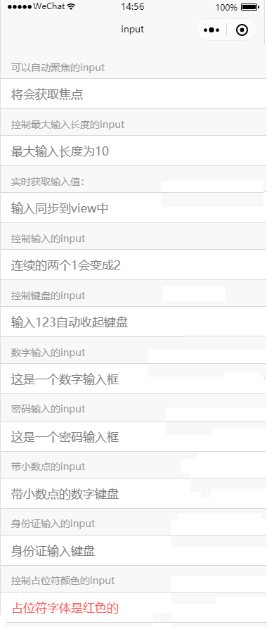
<view class="page-body">
  <view class="page-section">
    <view class="weui-cells__title">可以自动聚焦的input</view>
    <view class="weui-cells weui-cells_after-title">
      <view class="weui-cell weui-cell_input">
        <input class="weui-input" auto-focus placeholder="将会获取焦点"/>
      </view>
    </view>
  </view>
  <view class="page-section">
    <view class="weui-cells__title">控制最大输入长度的input</view>
    <view class="weui-cells weui-cells_after-title">
      <view class="weui-cell weui-cell_input">
        <input class="weui-input" maxlength="10" placeholder="最大输入长度为10" />
      </view>
    </view>
  </view>
  <view class="page-section">
    <view class="weui-cells__title">实时获取输入值:{{inputValue}}</view>
    <view class="weui-cells weui-cells_after-title">
      <view class="weui-cell weui-cell_input">
        <input class="weui-input"  maxlength="10" bindinput="bindKeyInput" placeholder="输入同步到view中"/>
      </view>
    </view>
  </view>
  <view class="page-section">
    <view class="weui-cells__title">控制输入的input</view>
    <view class="weui-cells weui-cells_after-title">
      <view class="weui-cell weui-cell_input">
        <input class="weui-input"  bindinput="bindReplaceInput" placeholder="连续的两个1会变成2" />
      </view>
    </view>
  </view>
  <view class="page-section">
    <view class="weui-cells__title">控制键盘的input</view>
    <view class="weui-cells weui-cells_after-title">
      <view class="weui-cell weui-cell_input">
        <input class="weui-input"  bindinput="bindHideKeyboard" placeholder="输入123自动收起键盘" />
      </view>
    </view>
  </view>
  <view class="page-section">
    <view class="weui-cells__title">数字输入的input</view>
    <view class="weui-cells weui-cells_after-title">
      <view class="weui-cell weui-cell_input">
        <input class="weui-input" type="number" placeholder="这是一个数字输入框" />
      </view>
    </view>
  </view>
  <view class="page-section">
    <view class="weui-cells__title">密码输入的input</view>
    <view class="weui-cells weui-cells_after-title">
      <view class="weui-cell weui-cell_input">
        <input class="weui-input" password type="text" placeholder="这是一个密码输入框" />
      </view>
    </view>
  </view>
  <view class="page-section">
    <view class="weui-cells__title">带小数点的input</view>
    <view class="weui-cells weui-cells_after-title">
      <view class="weui-cell weui-cell_input">
        <input class="weui-input" type="digit" placeholder="带小数点的数字键盘"/>
      </view>
    </view>
  </view>
  <view class="page-section">
    <view class="weui-cells__title">身份证输入的input</view>
    <view class="weui-cells weui-cells_after-title">
      <view class="weui-cell weui-cell_input">
        <input class="weui-input" type="idcard" placeholder="身份证输入键盘" />
      </view>
    </view>
  </view>
  <view class="page-section">
    <view class="weui-cells__title">控制占位符颜色的input</view>
    <view class="weui-cells weui-cells_after-title">
      <view class="weui-cell weui-cell_input">
        <input class="weui-input" placeholder-style="color:#F76260" placeholder="占位符字体是红色的" />
      </view>
    </view>
  </view>
</view>
Page({
data: {
focus: false,
inputValue: ''
},
bindKeyInput: function (e) {
this.setData({
inputValue: e.detail.value
})
},
bindReplaceInput: function (e) {
var value = e.detail.value
var pos = e.detail.cursor
var left
if (pos !== -1) {
// 光标在中间
left = e.detail.value.slice(0, pos)
// 计算光标的位置
pos = left.replace(/11/g, '2').length
}
// 直接返回对象,可以对输入进行过滤处理,同时可以控制光标的位置
return {
value: value.replace(/11/g, '2'),
cursor: pos
}
// 或者直接返回字符串,光标在最后边
// return value.replace(/11/g,'2'),
},
bindHideKeyboard: function (e) {
if (e.detail.value === '123') {
// 收起键盘
wx.hideKeyboard()
}
}
})
以上内容是否对您有帮助:


更多建议: