


进度条(Progress)
2024-01-25 13:15 更新
Progress是进度条显示组件,显示内容通常为某次目标操作的当前进度。具体用法请参考Progress。
- Progress(options: {value: number, total?: number, type?: ProgressType})
该接口用于创建type样式的进度条,其中value用于设置初始进度值,total用于设置进度总长度,type决定Progress样式。
- Progress({ value: 24, total: 100, type: ProgressType.Linear }) // 创建一个进度总长为100,初始进度值为24的线性进度条

设置进度条样式
Progress有5种可选类型,在创建时通过设置ProgressType枚举类型给type可选项指定Progress类型。其分别为:ProgressType.Linear(线性样式)、 ProgressType.Ring(环形无刻度样式)、ProgressType.ScaleRing(环形有刻度样式)、ProgressType.Eclipse(圆形样式)和ProgressType.Capsule(胶囊样式)。
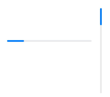
- 线性样式进度条(默认类型)说明
从API version9开始,组件高度大于宽度的时候自适应垂直显示,相等时仍然保持水平显示。
- Progress({ value: 20, total: 100, type: ProgressType.Linear }).width(200).height(50)
- Progress({ value: 20, total: 100, type: ProgressType.Linear }).width(50).height(200)
- 环形无刻度样式进度条
- // 从左往右,1号环形进度条,默认前景色为蓝色,默认strokeWidth进度条宽度为2.0vp
- Progress({ value: 40, total: 150, type: ProgressType.Ring }).width(100).height(100)
- // 从左往右,2号环形进度条
- Progress({ value: 40, total: 150, type: ProgressType.Ring }).width(100).height(100)
- .color(Color.Grey) // 进度条前景色为灰色
- .style({ strokeWidth: 15}) // 设置strokeWidth进度条宽度为15.0vp

- 环形有刻度样式进度条
- Progress({ value: 20, total: 150, type: ProgressType.ScaleRing }).width(100).height(100)
- .backgroundColor(Color.Black)
- .style({ scaleCount: 20, scaleWidth: 5 }) // 设置环形有刻度进度条总刻度数为20,刻度宽度为5vp
- Progress({ value: 20, total: 150, type: ProgressType.ScaleRing }).width(100).height(100)
- .backgroundColor(Color.Black)
- .style({ strokeWidth: 15, scaleCount: 20, scaleWidth: 5 }) // 设置环形有刻度进度条宽度15,总刻度数为20,刻度宽度为5vp
- Progress({ value: 20, total: 150, type: ProgressType.ScaleRing }).width(100).height(100)
- .backgroundColor(Color.Black)
- .style({ strokeWidth: 15, scaleCount: 20, scaleWidth: 3 }) // 设置环形有刻度进度条宽度15,总刻度数为20,刻度宽度为3vp

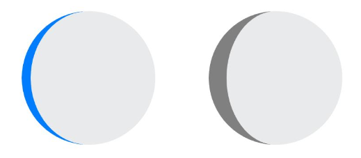
- 圆形样式进度条
- // 从左往右,1号圆形进度条,默认前景色为蓝色
- Progress({ value: 10, total: 150, type: ProgressType.Eclipse }).width(100).height(100)
- // 从左往右,2号圆形进度条,指定前景色为灰色
- Progress({ value: 20, total: 150, type: ProgressType.Eclipse }).color(Color.Grey).width(100).height(100)
- 胶囊样式进度条说明
1、头尾两端圆弧处的进度展示效果与ProgressType.Eclipse样式相同;
2、中段处的进度展示效果为矩形状长条,与ProgressType.Linear线性样式相似;
3、组件高度大于宽度的时候自适应垂直显示。
- Progress({ value: 10, total: 150, type: ProgressType.Capsule }).width(100).height(50)
- Progress({ value: 20, total: 150, type: ProgressType.Capsule }).width(50).height(100).color(Color.Grey)
- Progress({ value: 50, total: 150, type: ProgressType.Capsule }).width(50).height(100).backgroundColor(Color.Black)

场景示例
更新当前进度值,如应用安装进度条。可通过点击Button增加progressValue,.value()属性将progressValue设置给Progress组件,进度条组件即会触发刷新,更新当前进度。
- @Entry
- @Component
- struct ProgressCase1 {
- @State progressValue: number = 0 // 设置进度条初始值为0
- build() {
- Column() {
- Column() {
- Progress({value:0, total:100, type:ProgressType.Capsule}).width(200).height(50)
- .style({strokeWidth:50}).value(this.progressValue)
- Row().width('100%').height(5)
- Button("进度条+5")
- .onClick(()=>{
- this.progressValue += 5
- if (this.progressValue > 100){
- this.progressValue = 0
- }
- })
- }
- }.width('100%').height('100%')
- }
- }

以上内容是否对您有帮助:

更多建议: