


按钮(Button)
2024-01-25 13:14 更新
Button是按钮组件,通常用于响应用户的点击操作,其类型包括胶囊按钮、圆形按钮、普通按钮。Button当做为容器使用时可以通过添加子组件实现包含文字、图片等元素的按钮。具体用法请参考Button。
- 创建不包含子组件的按钮。
- Button(label?: string, options?: { type?: ButtonType, stateEffect?: boolean })
该接口用于创建不包含子组件的按钮,其中label用来设置按钮文字,type用于设置Button类型,stateEffect属性设置Button是否开启点击效果。
- Button('Ok', { type: ButtonType.Normal, stateEffect: true })
- .borderRadius(8)
- .backgroundColor(0x317aff)
- .width(90)
- .height(40)

- 创建包含子组件的按钮。
- Button(options?: {type?: ButtonType, stateEffect?: boolean})
该接口用于创建包含子组件的按钮,只支持包含一个子组件,子组件可以是基础组件或者容器组件。
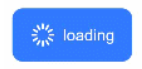
- Button({ type: ButtonType.Normal, stateEffect: true }) {
- Row() {
- Image($r('app.media.loading')).width(20).height(40).margin({ left: 12 })
- Text('loading').fontSize(12).fontColor(0xffffff).margin({ left: 5, right: 12 })
- }.alignItems(VerticalAlign.Center)
- }.borderRadius(8).backgroundColor(0x317aff).width(90).height(40)
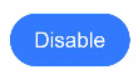
- 胶囊按钮(默认类型)
此类型按钮的圆角自动设置为高度的一半,不支持通过borderRadius属性重新设置圆角。
- Button('Disable', { type: ButtonType.Capsule, stateEffect: false })
- .backgroundColor(0x317aff)
- .width(90)
- .height(40)
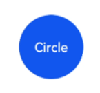
- 圆形按钮
此类型按钮为圆形,不支持通过borderRadius属性重新设置圆角。
- Button('Circle', { type: ButtonType.Circle, stateEffect: false })
- .backgroundColor(0x317aff)
- .width(90)
- .height(90)
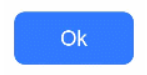
- 普通按钮
此类型的按钮默认圆角为0,支持通过borderRadius属性重新设置圆角。
- Button('Ok', { type: ButtonType.Normal, stateEffect: true })
- .borderRadius(8)
- .backgroundColor(0x317aff)
- .width(90)
- .height(40)
自定义样式
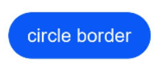
- 设置边框弧度。一般使用通用属性来自定义按钮样式。例如通过borderRadius属性设置按钮的边框弧度。
- Button('circle border', { type: ButtonType.Normal })
- .borderRadius(20)
- .height(40)
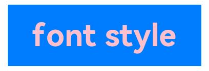
- 设置文本样式。
通过添加文本样式设置按钮文本的展示样式。
- Button('font style', { type: ButtonType.Normal })
- .fontSize(20)
- .fontColor(Color.Pink)
- .fontWeight(800)
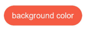
- 设置背景颜色。
添加backgroundColor属性设置按钮的背景颜色。
- Button('background color').backgroundColor(0xF55A42)
- 用作功能型按钮。
为删除操作创建一个按钮。
- Button({ type: ButtonType.Circle, stateEffect: true }) {
- Image($r('app.media.ic_public_delete_filled')).width(30).height(30)
- }.width(55).height(55).margin({ left: 20 }).backgroundColor(0xF55A42)

- Button('Ok', { type: ButtonType.Normal, stateEffect: true })
- .onClick(()=>{
- console.info('Button onClick')
- })
场景示例
- 用于启动操作。
可以用按钮启动任何用户界面元素,按钮会根据用户的操作触发相应的事件。例如,在List容器里通过点击按钮进行页面跳转。
- // xxx.ets
- import router from '@ohos.router';
- @Entry
- @Component
- struct ButtonCase1 {
- build() {
- List({ space: 4 }) {
- ListItem() {
- Button("First").onClick(() => {
- router.pushUrl({ url: 'pages/first_page' })
- })
- .width('100%')
- }
- ListItem() {
- Button("Second").onClick(() => {
- router.pushUrl({ url: 'pages/second_page' })
- })
- .width('100%')
- }
- ListItem() {
- Button("Third").onClick(() => {
- router.pushUrl({ url: 'pages/third_page' })
- })
- .width('100%')
- }
- }
- .listDirection(Axis.Vertical)
- .backgroundColor(0xDCDCDC).padding(20)
- }
- }

- 用于表单的提交。
在用户登录/注册页面,使用按钮进行登录或注册操作。
- // xxx.ets
- @Entry
- @Component
- struct ButtonCase2 {
- build() {
- Column() {
- TextInput({ placeholder: 'input your username' }).margin({ top: 20 })
- TextInput({ placeholder: 'input your password' }).type(InputType.Password).margin({ top: 20 })
- Button('Register').width(300).margin({ top: 20 })
- .onClick(() => {
- // 需要执行的操作
- })
- }.padding(20)
- }
- }

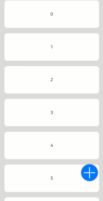
- 悬浮按钮
在可以滑动的界面,滑动时按钮始终保持悬浮状态。
- // xxx.ets
- @Entry
- @Component
- struct HoverButtonExample {
- private arr: number[] = [0, 1, 2, 3, 4, 5, 6, 7, 8, 9]
- build() {
- Stack() {
- List({ space: 20, initialIndex: 0 }) {
- ForEach(this.arr, (item) => {
- ListItem() {
- Text('' + item)
- .width('100%').height(100).fontSize(16)
- .textAlign(TextAlign.Center).borderRadius(10).backgroundColor(0xFFFFFF)
- }
- }, item => item)
- }.width('90%')
- Button() {
- Image($r('app.media.ic_public_add'))
- .width(50)
- .height(50)
- }
- .width(60)
- .height(60)
- .position({x: '80%', y: 600})
- .shadow({radius: 10})
- .onClick(() => {
- // 需要执行的操作
- })
- }
- .width('100%')
- .height('100%')
- .backgroundColor(0xDCDCDC)
- .padding({ top: 5 })
- }
- }
以上内容是否对您有帮助:
← 改善布局性能

更多建议: