


自定义弹窗(CustomDialog)
2024-01-25 13:16 更新
自定义弹窗(CustomDialog)可用于广告、中奖、警告、软件更新等与用户交互响应操作。开发者可以通过CustomDialogController类显示自定义弹窗。具体用法请参考自定义弹窗。
创建自定义弹窗
- 使用@CustomDialog装饰器装饰自定义弹窗。
- @CustomDialog装饰器用于装饰自定义弹框,此装饰器内进行自定义内容(也就是弹框内容)。
- @CustomDialog
- struct CustomDialogExample {
- controller: CustomDialogController
- build() {
- Column() {
- Text('我是内容')
- .fontSize(20)
- .margin({ top: 10, bottom: 10 })
- }
- }
- }
- 创建构造器,与装饰器呼应相连。
- dialogController: CustomDialogController = new CustomDialogController({
- builder: CustomDialogExample({}),
- })
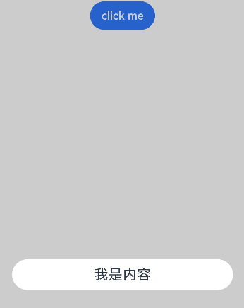
- 点击与onClick事件绑定的组件使弹窗弹出
- Flex({justifyContent:FlexAlign.Center}){
- Button('click me')
- .onClick(() => {
- this.dialogController.open()
- })
- }.width('100%')
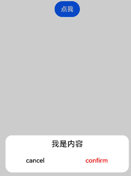
- 在@CustomDialog装饰器内添加按钮操作,同时添加数据函数的创建。
- @CustomDialog
- struct CustomDialogExample {
- controller: CustomDialogController
- cancel: () => void
- confirm: () => void
- build() {
- Column() {
- Text('我是内容').fontSize(20).margin({ top: 10, bottom: 10 })
- Flex({ justifyContent: FlexAlign.SpaceAround }) {
- Button('cancel')
- .onClick(() => {
- this.controller.close()
- this.cancel()
- }).backgroundColor(0xffffff).fontColor(Color.Black)
- Button('confirm')
- .onClick(() => {
- this.controller.close()
- this.confirm()
- }).backgroundColor(0xffffff).fontColor(Color.Red)
- }.margin({ bottom: 10 })
- }
- }
- }
- 页面内需要在构造器内进行接收,同时创建相应的函数操作。
- dialogController: CustomDialogController = new CustomDialogController({
- builder: CustomDialogExample({
- cancel: this.onCancel,
- confirm: this.onAccept,
- }),
- alignment: DialogAlignment.Default, // 可设置dialog的对齐方式,设定显示在底部或中间等,默认为底部显示
- })
- onCancel() {
- console.info('Callback when the first button is clicked')
- }
- onAccept() {
- console.info('Callback when the second button is clicked')
- }
完整示例
- // xxx.ets
- @CustomDialog
- struct CustomDialogExample {
- controller: CustomDialogController
- cancel: () => void
- confirm: () => void
- build() {
- Column() {
- Text('我是内容').fontSize(20).margin({ top: 10, bottom: 10 })
- Flex({ justifyContent: FlexAlign.SpaceAround }) {
- Button('cancel')
- .onClick(() => {
- this.controller.close()
- this.cancel()
- }).backgroundColor(0xffffff).fontColor(Color.Black)
- Button('confirm')
- .onClick(() => {
- this.controller.close()
- this.confirm()
- }).backgroundColor(0xffffff).fontColor(Color.Red)
- }.margin({ bottom: 10 })
- }
- }
- }
- @Entry
- @Component
- struct DialogExample {
- dialogController: CustomDialogController = new CustomDialogController({
- builder: CustomDialogExample({
- cancel: this.onCancel,
- confirm: this.onAccept,
- }),
- alignment: DialogAlignment.Default, // 可设置dialog的对齐方式,设定显示在底部或中间等,默认为底部显示
- })
- onCancel() {
- console.info('Callback when the first button is clicked')
- }
- onAccept() {
- console.info('Callback when the second button is clicked')
- }
- build() {
- Flex({ justifyContent: FlexAlign.Center }) {
- Button('click me')
- .onClick(() => {
- this.dialogController.open()
- })
- }.width('100%')
- }
- }
以上内容是否对您有帮助:

更多建议: