

气泡提示(Popup)
2024-01-25 13:17 更新
Popup属性可绑定在组件上显示气泡弹窗提示,设置弹窗内容、交互逻辑和显示状态。主要用于屏幕录制、信息弹出提醒等显示状态。
气泡分为两种类型,一种是系统提供的气泡PopupOptions,一种是开发者可以自定义的气泡CustomPopupOptions。其中PopupOptions为系统提供的气泡,通过配置primaryButton、secondaryButton来设置带按钮的气泡。CustomPopupOptions通过配置builder参数来设置自定义的气泡。
文本提示气泡
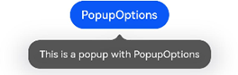
文本提示气泡常用于只展示带有文本的信息提示,不带有任何交互的场景。Popup属性需绑定组件,当bindPopup属性中参数show为true的时候会弹出气泡提示。
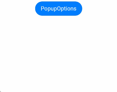
在Button组件上绑定Popup属性,每次点击Button按钮,handlePopup会切换布尔值,当其为true时,触发bindPopup弹出气泡。
- @Entry
- @Component
- struct PopupExample {
- @State handlePopup: boolean = false
- build() {
- Column() {
- Button('PopupOptions')
- .onClick(() => {
- this.handlePopup = !this.handlePopup
- })
- .bindPopup(this.handlePopup, {
- message: 'This is a popup with PopupOptions',
- })
- }.width('100%').padding({ top: 5 })
- }
- }
添加气泡状态变化的事件
通过onStateChange参数为气泡添加状态变化的事件回调,可以判断当前气泡的显示状态。
- @Entry
- @Component
- struct PopupExample {
- @State handlePopup: boolean = false
- build() {
- Column() {
- Button('PopupOptions')
- .onClick(() => {
- this.handlePopup = !this.handlePopup
- })
- .bindPopup(this.handlePopup, {
- message: 'This is a popup with PopupOptions',
- onStateChange: (e)=> { // 返回当前的气泡状态
- if (!e.isVisible) {
- this.handlePopup = false
- }
- }
- })
- }.width('100%').padding({ top: 5 })
- }
- }
带按钮的提示气泡
通过primaryButton、secondaryButton属性为气泡最多设置两个Button按钮,通过此按钮进行简单的交互,开发者可以通过配置action参数来设置想要触发的操作。
- @Entry
- @Component
- struct PopupExample22 {
- @State handlePopup: boolean = false
- build() {
- Column() {
- Button('PopupOptions').margin({ top: 200 })
- .onClick(() => {
- this.handlePopup = !this.handlePopup
- })
- .bindPopup(this.handlePopup, {
- message: 'This is a popup with PopupOptions',
- primaryButton: {
- value: 'Confirm',
- action: () => {
- this.handlePopup = !this.handlePopup
- console.info('confirm Button click')
- }
- },
- secondaryButton: {
- value: 'Cancel',
- action: () => {
- this.handlePopup = !this.handlePopup
- }
- },
- onStateChange: (e) => {
- if (!e.isVisible) {
- this.handlePopup = false
- }
- }
- })
- }.width('100%').padding({ top: 5 })
- }
- }

自定义气泡
开发者可以使用构建器CustomPopupOptions创建自定义气泡,@Builder中可以放自定义的内容。除此之外,还可以通过popupColor等参数控制气泡样式。
- @Entry
- @Component
- struct Index {
- @State customPopup: boolean = false
- // popup构造器定义弹框内容
- @Builder popupBuilder() {
- Row({ space: 2 }) {
- Image($r("app.media.icon")).width(24).height(24).margin({ left: 5 })
- Text('This is Custom Popup').fontSize(15)
- }.width(200).height(50).padding(5)
- }
- build() {
- Column() {
- Button('CustomPopupOptions')
- .position({x:100,y:200})
- .onClick(() => {
- this.customPopup = !this.customPopup
- })
- .bindPopup(this.customPopup, {
- builder: this.popupBuilder, // 气泡的内容
- placement:Placement.Bottom, // 气泡的弹出位置
- popupColor:Color.Pink, // 气泡的背景色
- onStateChange: (e) => {
- console.info(JSON.stringify(e.isVisible))
- if (!e.isVisible) {
- this.customPopup = false
- }
- }
- })
- }
- .height('100%')
- }
- }
使用者通过配置placement参数将弹出的气泡放到需要提示的位置。弹窗构造器会触发弹出提示信息,来引导使用者完成操作,也让使用者有更好的UI体验。

- @Entry
- @Component
- struct Index {
- @State customPopup: boolean = false
- // popup构造器定义弹框内容
- @Builder popupBuilder() {
- Row({ space: 2 }) {
- Image('/images/shengWhite.png').width(30).objectFit(ImageFit.Contain)
- Column(){
- Text('控制人生').fontSize(14).fontWeight(900).fontColor(Color.White).width('100%')
- Text('想要跟唱时,数千万歌曲任你选择,人声随心调整。').fontSize(12).fontColor('#ffeeeeee').width('100%')
- }
- }.width(230).height(80).padding(5)
- }
- build() {
- Row() {
- Text('我要K歌')
- Image('/images/sheng.png').width(35).objectFit(ImageFit.Contain)
- .onClick(() => {
- this.customPopup = !this.customPopup
- })
- .bindPopup(this.customPopup, {
- builder: this.popupBuilder,
- })
- }
- .margin(20)
- .height('100%')
- }
- }
以上内容是否对您有帮助:

更多建议: