


布局约束
2024-01-22 12:31 更新
通过组件的宽高比和显示优先级约束组件显示效果。
说明
从API Version 7开始支持。后续版本如有新增内容,则采用上角标单独标记该内容的起始版本。
属性
名称 | 参数说明 | 描述 |
|---|---|---|
aspectRatio | number | 指定当前组件的宽高比,aspectRatio = width/height。 从API version 9开始,该接口支持在ArkTS卡片中使用。 |
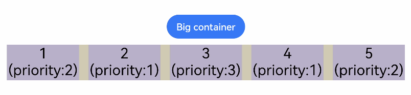
displayPriority | number | 设置当前组件在布局容器中显示的优先级,当父容器空间不足时,低优先级的组件会被隐藏。 小数点后的数字不作优先级区分,即区间为[x, x + 1)内的数字视为相同优先级。例如:1.0与1.9为同一优先级。 从API version 9开始,该接口支持在ArkTS卡片中使用。 说明: 仅在Row/Column/Flex(单行)容器组件中生效。 |
示例
- // xxx.ets
- @Entry
- @Component
- struct AspectRatioExample {
- private children: string[] = ['1', '2', '3', '4', '5', '6']
- build() {
- Column({ space: 20 }) {
- Text('using container: row').fontSize(14).fontColor(0xCCCCCC).width('100%')
- Row({ space: 10 }) {
- ForEach(this.children, (item) => {
- // 组件宽度 = 组件高度*1.5 = 90
- Text(item)
- .backgroundColor(0xbbb2cb)
- .fontSize(20)
- .aspectRatio(1.5)
- .height(60)
- .textAlign(TextAlign.Center)
- // 组件高度 = 组件宽度/1.5 = 60/1.5 = 40
- Text(item)
- .backgroundColor(0xbbb2cb)
- .fontSize(20)
- .aspectRatio(1.5)
- .width(60)
- }, item => item)
- }
- .size({ width: "100%", height: 100 })
- .backgroundColor(0xd2cab3)
- .clip(true)
- // grid子元素width/height=3/2
- Text('using container: grid').fontSize(14).fontColor(0xCCCCCC).width('100%')
- Grid() {
- ForEach(this.children, (item) => {
- GridItem() {
- Text(item)
- .backgroundColor(0xbbb2cb)
- .fontSize(40)
- .width('100%')
- .aspectRatio(1.5)
- .textAlign(TextAlign.Center)
- }
- }, item => item)
- }
- .columnsTemplate('1fr 1fr 1fr')
- .columnsGap(10)
- .rowsGap(10)
- .size({ width: "100%", height: 165 })
- .backgroundColor(0xd2cab3)
- }.padding(10)
- }
- }
图1 竖屏显示
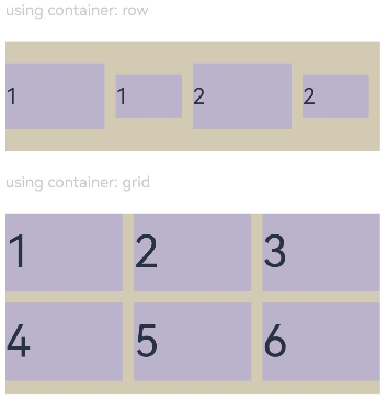
图2 横屏显示

- class ContainerInfo {
- label: string = '';
- size: string = '';
- }
- class ChildInfo {
- text: string = '';
- priority: number = 0;
- }
- @Entry
- @Component
- struct DisplayPriorityExample {
- // 显示容器大小
- private container: ContainerInfo[] = [
- { label: 'Big container', size: '90%' },
- { label: 'Middle container', size: '50%' },
- { label: 'Small container', size: '30%' }
- ]
- private children: ChildInfo[] = [
- { text: '1\n(priority:2)', priority: 2 },
- { text: '2\n(priority:1)', priority: 1 },
- { text: '3\n(priority:3)', priority: 3 },
- { text: '4\n(priority:1)', priority: 1 },
- { text: '5\n(priority:2)', priority: 2 }
- ]
- @State currentIndex: number = 0;
- build() {
- Column({ space: 10 }) {
- // 切换父级容器大小
- Button(this.container[this.currentIndex].label).backgroundColor(0x317aff)
- .onClick(() => {
- this.currentIndex = (this.currentIndex + 1) % this.container.length;
- })
- // 通过变量设置Flex父容器宽度
- Flex({ justifyContent: FlexAlign.SpaceBetween }) {
- ForEach(this.children, (item) => {
- // 使用displayPriority给子组件绑定显示优先级
- Text(item.text)
- .width(120)
- .height(60)
- .fontSize(24)
- .textAlign(TextAlign.Center)
- .backgroundColor(0xbbb2cb)
- .displayPriority(item.priority)
- }, item => item.text)
- }
- .width(this.container[this.currentIndex].size)
- .backgroundColor(0xd2cab3)
- }.width("100%").margin({ top: 50 })
- }
- }
横屏显示
以上内容是否对您有帮助:
← 位置设置

更多建议: