

单选框
2024-01-22 17:23 更新
单选框,提供相应的用户交互选择项。
说明
该组件从API Version 8开始支持。后续版本如有新增内容,则采用上角标单独标记该内容的起始版本。
接口
Radio(options: {value: string, group: string})
从API version 9开始,该接口支持在ArkTS卡片中使用。
参数:
参数名 | 参数类型 | 必填 | 参数描述 |
|---|---|---|---|
value | string | 是 | 当前单选框的值。 |
group | string | 是 | 当前单选框的所属群组名称,相同group的Radio只能有一个被选中。 |
事件
除支持通用事件外,还支持以下事件:
名称 | 功能描述 |
|---|---|
onChange(callback: (isChecked: boolean) => void) | 单选框选中状态改变时触发回调。 - isChecked为true时,表示从未选中变为选中。 - isChecked为false时,表示从选中变为未选中。 从API version 9开始,该接口支持在ArkTS卡片中使用。 |
示例
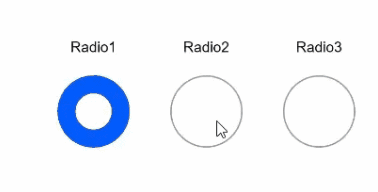
- // xxx.ets
- @Entry
- @Component
- struct RadioExample {
- build() {
- Flex({ direction: FlexDirection.Row, justifyContent: FlexAlign.Center, alignItems: ItemAlign.Center }) {
- Column() {
- Text('Radio1')
- Radio({ value: 'Radio1', group: 'radioGroup' }).checked(true)
- .height(50)
- .width(50)
- .onChange((isChecked: boolean) => {
- console.log('Radio1 status is ' + isChecked)
- })
- }
- Column() {
- Text('Radio2')
- Radio({ value: 'Radio2', group: 'radioGroup' }).checked(false)
- .height(50)
- .width(50)
- .onChange((isChecked: boolean) => {
- console.log('Radio2 status is ' + isChecked)
- })
- }
- Column() {
- Text('Radio3')
- Radio({ value: 'Radio3', group: 'radioGroup' }).checked(false)
- .height(50)
- .width(50)
- .onChange((isChecked: boolean) => {
- console.log('Radio3 status is ' + isChecked)
- })
- }
- }.padding({ top: 30 })
- }
- }
以上内容是否对您有帮助:

更多建议: