


栅格设置
从API Version 7开始支持。后续版本如有新增内容,则采用上角标单独标记该内容的起始版本。
栅格布局的列宽、列间距由距离最近的GridContainer父组件决定。使用栅格属性的组件树上至少需要有1个GridContainer容器组件。
属性
名称 | 参数类型 | 描述 |
|---|---|---|
useSizeType(deprecated) | { xs?: number | { span: number, offset: number }, sm?: number | { span: number, offset: number }, md?: number | { span: number, offset: number }, lg?: number | { span: number, offset: number } } | 设置在特定设备宽度类型下的占用列数和偏移列数,span: 占用列数; offset: 偏移列数。 当值为number类型时,仅设置列数, 当格式如{"span": 1, "offset": 0}时,指同时设置占用列数与偏移列数。 - xs: 指设备宽度类型为SizeType.XS时的占用列数和偏移列数。 - sm: 指设备宽度类型为SizeType.SM时的占用列数和偏移列数。 - md: 指设备宽度类型为SizeType.MD时的占用列数和偏移列数。 - lg: 指设备宽度类型为SizeType.LG时的占用列数和偏移列数。 |
gridSpan | number | 默认占用列数,指useSizeType属性没有设置对应尺寸的列数(span)时,占用的栅格列数。 说明: 设置了栅格span属性,组件的宽度由栅格布局决定。 默认值:1 |
gridOffset | number | 默认偏移列数,指useSizeType属性没有设置对应尺寸的偏移(offset)时, 当前组件沿着父组件Start方向,偏移的列数,也就是当前组件位于第n列。 说明: - 配置该属性后,当前组件在父组件水平方向的布局不再跟随父组件原有的布局方式,而是沿着父组件的Start方向偏移一定位移。 - 偏移位移 = (列宽 + 间距)* 列数。 - 设置了偏移(gridOffset)的组件之后的兄弟组件会根据该组件进行相对布局,类似相对布局。 默认值:0 |
示例
- // xxx.ets
- @Entry
- @Component
- struct GridContainerExample1 {
- build() {
- Column() {
- Text('useSizeType').fontSize(15).fontColor(0xCCCCCC).width('90%')
- GridContainer() {
- Row({}) {
- Row() {
- Text('Left').fontSize(25)
- }
- .useSizeType({
- xs: { span: 1, offset: 0 }, sm: { span: 1, offset: 0 },
- md: { span: 1, offset: 0 }, lg: { span: 2, offset: 0 }
- })
- .height("100%")
- .backgroundColor(0x66bbb2cb)
- Row() {
- Text('Center').fontSize(25)
- }
- .useSizeType({
- xs: { span: 1, offset: 0 }, sm: { span: 2, offset: 1 },
- md: { span: 5, offset: 1 }, lg: { span: 7, offset: 2 }
- })
- .height("100%")
- .backgroundColor(0x66b6c5d1)
- Row() {
- Text('Right').fontSize(25)
- }
- .useSizeType({
- xs: { span: 1, offset: 0 }, sm: { span: 1, offset: 3 },
- md: { span: 2, offset: 6 }, lg: { span: 3, offset: 9 }
- })
- .height("100%")
- .backgroundColor(0x66bbb2cb)
- }
- .height(200)
- }
- .backgroundColor(0xf1f3f5)
- .margin({ top: 10 })
- // 单独设置组件的span和offset,在sm尺寸大小的设备上使用useSizeType中sm的数据实现一样的效果
- Text('gridSpan,gridOffset').fontSize(15).fontColor(0xCCCCCC).width('90%')
- GridContainer() {
- Row() {
- Row() {
- Text('Left').fontSize(25)
- }
- .gridSpan(1)
- .height("100%")
- .backgroundColor(0x66bbb2cb)
- Row() {
- Text('Center').fontSize(25)
- }
- .gridSpan(2)
- .gridOffset(1)
- .height("100%")
- .backgroundColor(0x66b6c5d1)
- Row() {
- Text('Right').fontSize(25)
- }
- .gridSpan(1)
- .gridOffset(3)
- .height("100%")
- .backgroundColor(0x66bbb2cb)
- }.height(200)
- }
- }
- }
- }
图1 设备宽度为SM
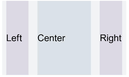
图2 设备宽度为MD
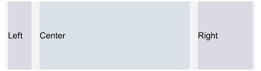
图3 设备宽度为LG
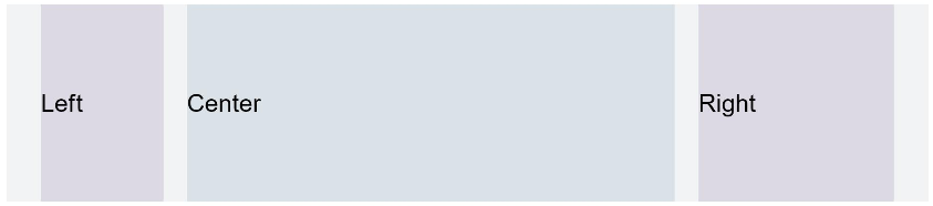
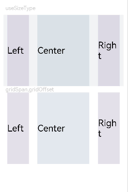
图4 单独设置gridSpan和gridOffset在特定屏幕大小下的效果与useSizeType效果一致

更多建议: