
 免费 AI IDE

选择评分的组件
提供在给定范围内选择评分的组件。
该组件从API Version 7开始支持。后续版本如有新增内容,则采用上角标单独标记该内容的起始版本。
接口
Rating(options?: { rating: number, indicator?: boolean })
从API version 9开始,该接口支持在ArkTS卡片中使用。
参数:
参数名 | 参数类型 | 必填 | 参数描述 |
|---|---|---|---|
rating | number | 是 | 设置并接收评分值。 默认值:0 取值范围: [0, stars] 小于0取0,大于stars取最大值stars。 |
indicator | boolean | 否 | 设置评分组件作为指示器使用,不可改变评分。 默认值:false, 可进行评分 说明: indicator=true时,默认组件高度height=12.0vp,组件width=height * stars。 indicator=false时,默认组件高度height=28.0vp,组件width=height * stars。 |
属性
名称 | 参数类型 | 描述 |
|---|---|---|
stars | number | 设置评分总数。 默认值:5 从API version 9开始,该接口支持在ArkTS卡片中使用。 说明: 设置为小于0的值时,按默认值显示。 |
stepSize | number | 操作评级的步长。 默认值:0.5 从API version 9开始,该接口支持在ArkTS卡片中使用。 说明: 设置为小于0.1的值时,按默认值显示。 取值范围为[0.1, stars]。 |
starStyle | { backgroundUri: string, foregroundUri: string, secondaryUri?: string } | backgroundUri:未选中的星级的图片链接,可由用户自定义或使用系统默认图片。 foregroundUri:选中的星级的图片路径,可由用户自定义或使用系统默认图片。 secondaryUri:部分选中的星级的图片路径,可由用户自定义或使用系统默认图片。 从API version 9开始,该接口支持在ArkTS卡片中使用。 说明: startStyle属性所支持的图片类型能力参考Image组件。 支持加载本地图片和网络图片,暂不支持PixelMap类型和Resource资源。 默认图片加载方式为异步,暂不支持同步加载。 设置值为undefined或者空字符串时,rating会选择加载系统默认星型图源。 |
rating宽高为[width, height]时,单个图片的绘制区域为[width / stars, height]。
为了指定绘制区域为方形,建议自定义宽高时采取[height * stars, height], width = height * stars的方式。
事件
名称 | 功能描述 |
|---|---|
onChange(callback:(value: number) => void) | 操作评分条的评星发生改变时触发该回调。 从API version 9开始,该接口支持在ArkTS卡片中使用。 |
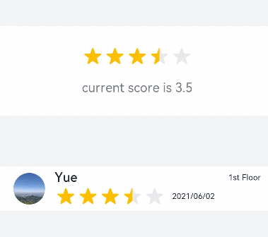
示例1
- // xxx.ets
- @Entry
- @Component
- struct RatingExample {
- @State rating: number = 3.5
- build() {
- Column() {
- Column() {
- Rating({ rating: this.rating, indicator: false })
- .stars(5)
- .stepSize(0.5)
- .margin({ top: 24 })
- .onChange((value: number) => {
- this.rating = value
- })
- Text('current score is ' + this.rating)
- .fontSize(16)
- .fontColor('rgba(24,36,49,0.60)')
- .margin({ top: 16 })
- }.width(360).height(113).backgroundColor('#FFFFFF').margin({ top: 68 })
- Row() {
- Image('common/testImage.jpg')
- .width(40)
- .height(40)
- .borderRadius(20)
- .margin({ left: 24 })
- Column() {
- Text('Yue')
- .fontSize(16)
- .fontColor('#182431')
- .fontWeight(500)
- Row() {
- Rating({ rating: 3.5, indicator: false }).margin({ top: 1, right: 8 })
- Text('2021/06/02')
- .fontSize(10)
- .fontColor('#182431')
- }
- }.margin({ left: 12 }).alignItems(HorizontalAlign.Start)
- Text('1st Floor')
- .fontSize(10)
- .fontColor('#182431')
- .position({ x: 295, y: 8 })
- }.width(360).height(56).backgroundColor('#FFFFFF').margin({ top: 64 })
- }.width('100%').height('100%').backgroundColor('#F1F3F5')
- }
- }
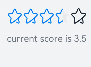
示例2
- // xxx.ets
- @Entry
- @Component
- struct RatingExample {
- @State rating: number = 3.5
- build() {
- Column() {
- Rating({ rating: this.rating, indicator: false })
- .stars(5)
- .stepSize(0.5)
- .starStyle({
- backgroundUri: '/common/imag1.png', // common目录与pages同级
- foregroundUri: '/common/imag2.png',
- secondaryUri: '/common/imag3.png'
- })
- .margin({ top: 24 })
- .onChange((value: number) => {
- this.rating = value
- })
- Text('current score is ' + this.rating)
- .fontSize(16)
- .fontColor('rgba(24,36,49,0.60)')
- .margin({ top: 16 })
- }.width('100%').height('100%').backgroundColor('#F1F3F5')
- }
- }


更多建议: