
 免费 AI IDE
警告弹窗
2024-01-22 18:20 更新
显示警告弹窗组件,可设置文本内容与响应回调。
说明
从API Version 7开始支持。后续版本如有新增内容,则采用上角标单独标记该内容的起始版本。
AlertDialogParamWithConfirm对象说明
| 参数名 | 参数类型 | 必填 | 参数描述 |
|---|---|---|---|
| title | ResourceStr | 否 | 弹窗标题。 |
| message | ResourceStr | 是 | 弹窗内容。 |
| autoCancel | boolean | 否 | 点击遮障层时,是否关闭弹窗。 默认值:true |
| confirm | { value: ResourceStr, fontColor?: ResourceColor, backgroundColor?: ResourceColor, action: () => void } | 否 | 确认按钮的文本内容、文本色、按钮背景色和点击回调。 |
| cancel | () => void | 否 | 点击遮障层关闭dialog时的回调。 |
| alignment | DialogAlignment | 否 | 弹窗在竖直方向上的对齐方式。 默认值:DialogAlignment.Default |
| offset | Offset | 否 | 弹窗相对alignment所在位置的偏移量。 |
| gridCount | number | 否 | 弹窗容器宽度所占用栅格数。 |
AlertDialogParamWithButtons对象说明
| 参数名 | 参数类型 | 必填 | 参数描述 |
|---|---|---|---|
| title | ResourceStr | 否 | 弹窗标题。 |
| message | ResourceStr | 是 | 弹窗内容。 |
| autoCancel | boolean | 否 | 点击遮障层时,是否关闭弹窗。 默认值:true |
| primaryButton | { value: ResourceStr, fontColor?: ResourceColor, backgroundColor?: ResourceColor, action: () => void; } | 否 | 按钮的文本内容、文本色、按钮背景色和点击回调。 |
| secondaryButton | { value: ResourceStr, fontColor?: ResourceColor, backgroundColor?: ResourceColor, action: () => void; } | 否 | 按钮的文本内容、文本色、按钮背景色和点击回调。 |
| cancel | () => void | 否 | 点击遮障层关闭dialog时的回调。 |
| alignment | DialogAlignment | 否 | 弹窗在竖直方向上的对齐方式。 默认值:DialogAlignment.Default |
| offset | Offset | 否 | 弹窗相对alignment所在位置的偏移量。 |
| gridCount | number | 否 | 弹窗容器宽度所占用栅格数。 |
DialogAlignment枚举说明
| 名称 | 描述 |
|---|---|
| Top | 垂直顶部对齐。 |
| Center | 垂直居中对齐。 |
| Bottom | 垂直底部对齐。 |
| Default | 默认对齐。 |
| TopStart8+ | 左上对齐。 |
| TopEnd8+ | 右上对齐。 |
| CenterStart8+ | 左中对齐。 |
| CenterEnd8+ | 右中对齐。 |
| BottomStart8+ | 左下对齐。 |
| BottomEnd8+ | 右下对齐。 |
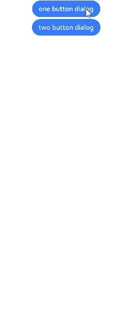
示例
- // xxx.ets
- @Entry
- @Component
- struct AlertDialogExample {
- build() {
- Column({ space: 5 }) {
- Button('one button dialog')
- .onClick(() => {
- AlertDialog.show(
- {
- title: 'title',
- message: 'text',
- autoCancel: true,
- alignment: DialogAlignment.Bottom,
- offset: { dx: 0, dy: -20 },
- gridCount: 3,
- confirm: {
- value: 'button',
- action: () => {
- console.info('Button-clicking callback')
- }
- },
- cancel: () => {
- console.info('Closed callbacks')
- }
- }
- )
- })
- .backgroundColor(0x317aff)
- Button('two button dialog')
- .onClick(() => {
- AlertDialog.show(
- {
- title: 'title',
- message: 'text',
- autoCancel: true,
- alignment: DialogAlignment.Bottom,
- gridCount: 4,
- offset: { dx: 0, dy: -20 },
- primaryButton: {
- value: 'cancel',
- action: () => {
- console.info('Callback when the first button is clicked')
- }
- },
- secondaryButton: {
- value: 'ok',
- action: () => {
- console.info('Callback when the second button is clicked')
- }
- },
- cancel: () => {
- console.info('Closed callbacks')
- }
- }
- )
- }).backgroundColor(0x317aff)
- }.width('100%').margin({ top: 5 })
- }
- }
以上内容是否对您有帮助:
← 路径动画


更多建议: