

鸿蒙OS 自定义组件
2021-06-25 14:06 更新
JS UI 框架支持自定义组件,用户可根据业务需求将已有的组件进行扩展,增加自定义的私有属性和事件,封装成新的组件,方便在工程中多次调用,提高页面布局代码的可读性。具体的封装方法示例如下:
- 构建自定义组件
  <!-- comp.hml -->
   <div class="item">
     <text class="title-style">{{title}}</text>
     <text class="text-style" onclick="childClicked" focusable="true">点击这里查看隐藏文本</text>
     <text class="text-style" if="{{show}}">hello world</text>
   </div>
/* comp.css */
.item {
width: 700px;
flex-direction: column;
height: 300px;
align-items: center;
margin-top: 100px;
}
.text-style {
width: 100%;
text-align: center;
font-weight: 500;
font-family: Courier;
font-size: 36px;
}
.title-style {
font-weight: 500;
font-family: Courier;
font-size: 50px;
color: #483d8b;
}- 引入自定义组件
  <!-- xxx.hml -->
   <element name='comp' src='../../common/component/comp.hml'></element>
   <div class="container">
     <text>父组件:{{text}}</text>
     <comp title="自定义组件" show-object="{{show}}" @event-type1="textClicked"></comp>
   </div>
/* xxx.css */
.container {
background-color: #f8f8ff;
flex: 1;
flex-direction: column;
align-content: center;
} // xxx.js
export default {
data: {
text: '开始',
show: false,
},
textClicked (e) {
this.text = e.detail.text;
},
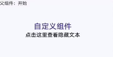
}本示例中父组件通过添加自定义属性向子组件传递了名称为 title 的参数,子组件在 props 中接收,同时子组件也通过事件绑定向上传递了参数 text,接收时通过 e.detail 获取,要绑定子组件事件,父组件事件命名必须遵循事件绑定规则,详见 自定义组件开发规范。自定义组件效果如下图所示:
图1 自定义组件静态效果
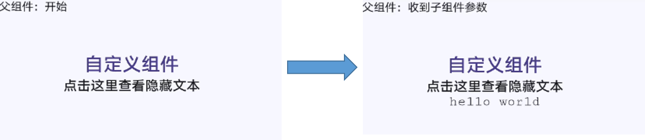
图2 自定义组件动态效果
以上内容是否对您有帮助:
← 焦点逻辑

更多建议: