
 免费 AI IDE
ElementPlus Card 卡片
2021-09-27 09:32 更新
Card 卡片
将信息聚合在卡片容器中展示。
基础用法
包含标题,内容和操作。
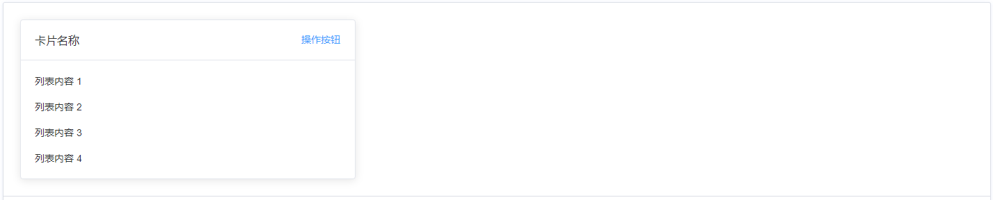
Card 组件包括header和body部分,header部分需要有显式具名 slot 分发,同时也是可选的。
<template>
<el-card class="box-card">
<template #header>
<div class="card-header">
<span>卡片名称</span>
<el-button class="button" type="text">操作按钮</el-button>
</div>
</template>
<div v-for="o in 4" :key="o" class="text item">{{'列表内容 ' + o }}</div>
</el-card>
</template>
<style>
.card-header {
display: flex;
justify-content: space-between;
align-items: center;
}
.text {
font-size: 14px;
}
.item {
margin-bottom: 18px;
}
.box-card {
width: 480px;
}
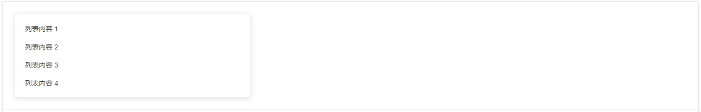
</style>简单卡片
卡片可以只有内容区域。
<template>
  <el-card class="box-card">
  <div v-for="o in 4" :key="o" class="text item">{{'列表内容 ' + o }}</div>
</el-card>
</template>

<style>
  .text {
    font-size: 14px;
  }

  .item {
    padding: 18px 0;
  }

  .box-card {
    width: 480px;
  }
</style>
带图片
可配置定义更丰富的内容展示。
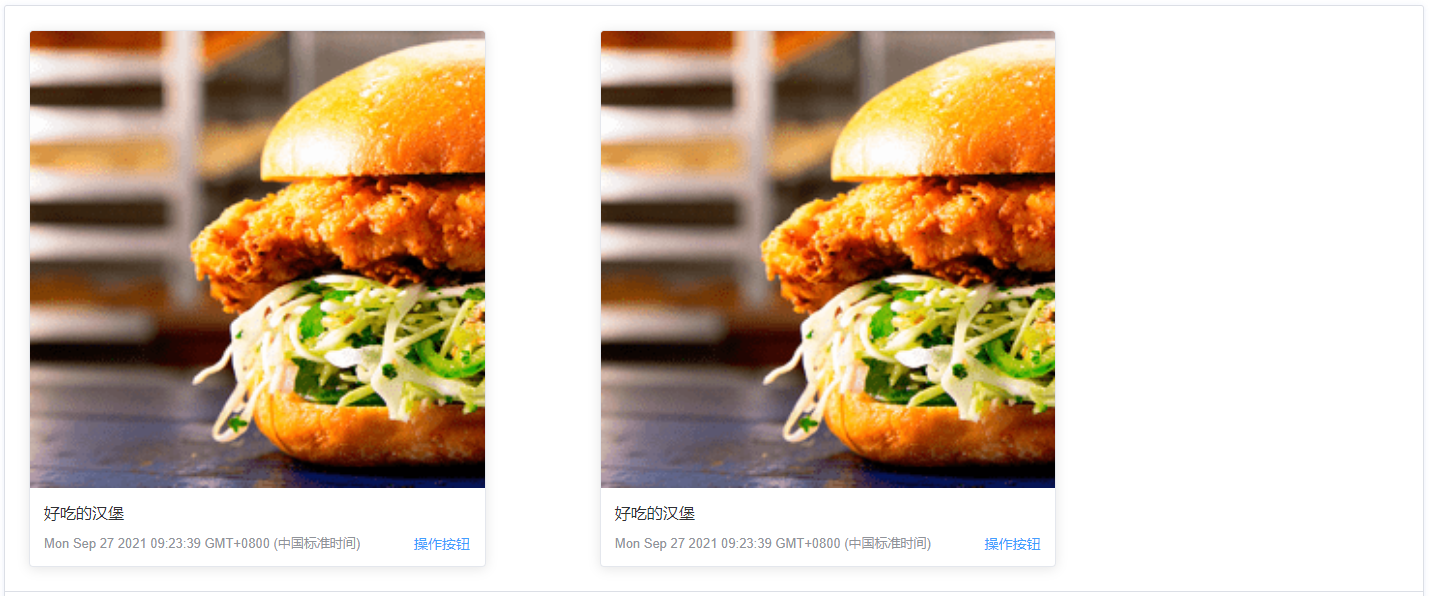
配置body-style属性来自定义body部分的style,我们还使用了布局组件。
<template>
  <el-row>
  <el-col
    :span="8"
    v-for="(o, index) in 2"
    :key="o"
    :offset="index > 0 ? 2 : 0"
  >
    <el-card :body-style="{ padding: '0px' }">
      <img
        src="https://shadow.elemecdn.com/app/element/hamburger.9cf7b091-55e9-11e9-a976-7f4d0b07eef6.png" rel="external nofollow"
        class="image"
      />
      <div style="padding: 14px;">
        <span>好吃的汉堡</span>
        <div class="bottom">
          <time class="time">{{ currentDate }}</time>
          <el-button type="text" class="button">操作按钮</el-button>
        </div>
      </div>
    </el-card>
  </el-col>
</el-row>
</template>

<script>
  export default {
    data() {
      return {
        currentDate: new Date(),
      }
    },
  }
</script>
<style>
  .time {
    font-size: 13px;
    color: #999;
  }

  .bottom {
    margin-top: 13px;
    line-height: 12px;
    display: flex;
    justify-content: space-between;
    align-items: center;
  }

  .button {
    padding: 0;
    min-height: auto;
  }

  .image {
    width: 100%;
    display: block;
  }
</style>
卡片阴影
可对阴影的显示进行配置。

通过shadow属性设置卡片阴影出现的时机:always、hover或never。
<template>
  <el-row :gutter="12">
  <el-col :span="8">
    <el-card shadow="always"> 总是显示 </el-card>
  </el-col>
  <el-col :span="8">
    <el-card shadow="hover"> 鼠标悬浮时显示 </el-card>
  </el-col>
  <el-col :span="8">
    <el-card shadow="never"> 从不显示 </el-card>
  </el-col>
</el-row>
</template>
Attributes
| 参数 | 说明 | 类型 | 可选值 | 默认值 |
|---|---|---|---|---|
| header | 设置 header,也可以通过 slot#header 传入 DOM | string | — | — |
| body-style | 设置 body 的样式 | object | — | { padding: '20px' } |
| shadow | 设置阴影显示时机 | string | always / hover / never | always |
以上内容是否对您有帮助:


更多建议: