
 免费 AI IDE
ElementPlus Button 按钮
2021-09-07 13:57 更新
Button 按钮
常用的操作按钮。
基础用法
基础的按钮用法。
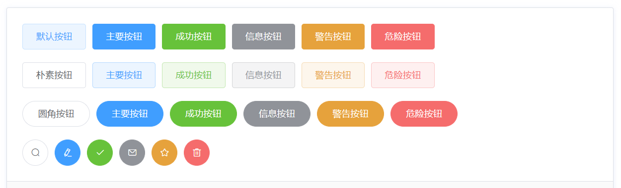
使用
type、plain、round和circle属性来定义 Button 的样式。
<template>
  <el-row>
  <el-button>默认按钮</el-button>
  <el-button type="primary">主要按钮</el-button>
  <el-button type="success">成功按钮</el-button>
  <el-button type="info">信息按钮</el-button>
  <el-button type="warning">警告按钮</el-button>
  <el-button type="danger">危险按钮</el-button>
</el-row>

<el-row>
  <el-button plain>朴素按钮</el-button>
  <el-button type="primary" plain>主要按钮</el-button>
  <el-button type="success" plain>成功按钮</el-button>
  <el-button type="info" plain>信息按钮</el-button>
  <el-button type="warning" plain>警告按钮</el-button>
  <el-button type="danger" plain>危险按钮</el-button>
</el-row>

<el-row>
  <el-button round>圆角按钮</el-button>
  <el-button type="primary" round>主要按钮</el-button>
  <el-button type="success" round>成功按钮</el-button>
  <el-button type="info" round>信息按钮</el-button>
  <el-button type="warning" round>警告按钮</el-button>
  <el-button type="danger" round>危险按钮</el-button>
</el-row>

<el-row>
  <el-button icon="el-icon-search" circle></el-button>
  <el-button type="primary" icon="el-icon-edit" circle></el-button>
  <el-button type="success" icon="el-icon-check" circle></el-button>
  <el-button type="info" icon="el-icon-message" circle></el-button>
  <el-button type="warning" icon="el-icon-star-off" circle></el-button>
  <el-button type="danger" icon="el-icon-delete" circle></el-button>
</el-row>
</template>
禁用状态
按钮不可用状态。
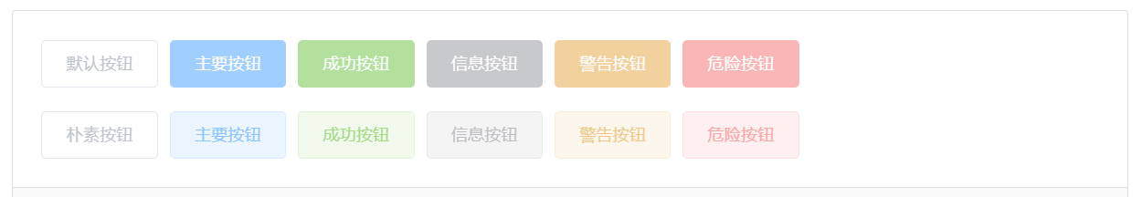
你可以使用disabled属性来定义按钮是否可用,它接受一个Boolean值。
<template>
  <el-row>
  <el-button disabled>默认按钮</el-button>
  <el-button type="primary" disabled>主要按钮</el-button>
  <el-button type="success" disabled>成功按钮</el-button>
  <el-button type="info" disabled>信息按钮</el-button>
  <el-button type="warning" disabled>警告按钮</el-button>
  <el-button type="danger" disabled>危险按钮</el-button>
</el-row>

<el-row>
  <el-button plain disabled>朴素按钮</el-button>
  <el-button type="primary" plain disabled>主要按钮</el-button>
  <el-button type="success" plain disabled>成功按钮</el-button>
  <el-button type="info" plain disabled>信息按钮</el-button>
  <el-button type="warning" plain disabled>警告按钮</el-button>
  <el-button type="danger" plain disabled>危险按钮</el-button>
</el-row>
</template>
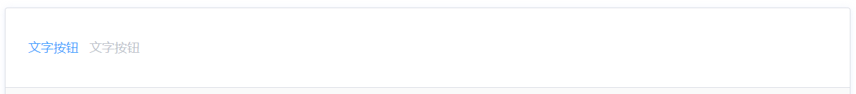
文字按钮
没有边框和背景色的按钮。
<template>
  <el-button type="text">文字按钮</el-button>
<el-button type="text" disabled>文字按钮</el-button>
</template>
图标按钮
带图标的按钮可增强辨识度(有文字)或节省空间(无文字)。
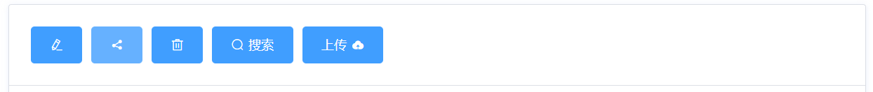
设置
icon属性即可,icon 的列表可以参考 Element Plus 的 icon 组件,也可以设置在文字右边的 icon ,只要使用i标签即可,可以使用自定义图标。
<template>
  <el-button type="primary" icon="el-icon-edit"></el-button>
<el-button type="primary" icon="el-icon-share"></el-button>
<el-button type="primary" icon="el-icon-delete"></el-button>
<el-button type="primary" icon="el-icon-search">搜索</el-button>
<el-button type="primary"
  >上传<i class="el-icon-upload el-icon--right"></i
></el-button>
</template>
按钮组
以按钮组的方式出现,常用于多项类似操作。
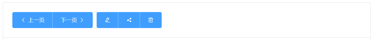
使用
<el-button-group>标签来嵌套你的按钮。
<template>
  <el-button-group>
  <el-button type="primary" icon="el-icon-arrow-left">上一页</el-button>
  <el-button type="primary"
    >下一页<i class="el-icon-arrow-right el-icon--right"></i
  ></el-button>
</el-button-group>
<el-button-group>
  <el-button type="primary" icon="el-icon-edit"></el-button>
  <el-button type="primary" icon="el-icon-share"></el-button>
  <el-button type="primary" icon="el-icon-delete"></el-button>
</el-button-group>
</template>
加载中
点击按钮后进行数据加载操作,在按钮上显示加载状态。
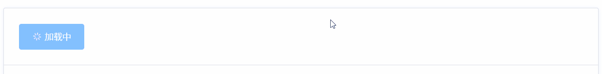
要设置为 loading 状态,只要设置
loading属性为true即可。
<template>
  <el-button type="primary" :loading="true">加载中</el-button>
</template>
不同尺寸
Button 组件提供除了默认值以外的三种尺寸,可以在不同场景下选择合适的按钮尺寸。
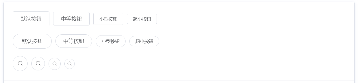
额外的尺寸:
medium、small、mini,通过设置size属性来配置它们。
<template>
  <el-row>
  <el-button>默认按钮</el-button>
  <el-button size="medium">中等按钮</el-button>
  <el-button size="small">小型按钮</el-button>
  <el-button size="mini">超小按钮</el-button>
</el-row>
<el-row>
  <el-button round>默认按钮</el-button>
  <el-button size="medium" round>中等按钮</el-button>
  <el-button size="small" round>小型按钮</el-button>
  <el-button size="mini" round>超小按钮</el-button>
</el-row>
<el-row>
  <el-button icon="el-icon-search" circle></el-button>
  <el-button icon="el-icon-search" size="medium" circle></el-button>
  <el-button icon="el-icon-search" size="small" circle></el-button>
  <el-button icon="el-icon-search" size="mini" circle></el-button>
</el-row>
</template>
Button Attributes
| 参数 | 说明 | 类型 | 可选值 | 默认值 |
|---|---|---|---|---|
| size | 尺寸 | string | medium / small / mini | — |
| type | 类型 | string | primary / success / warning / danger / info / text | — |
| plain | 是否朴素按钮 | boolean | — | false |
| round | 是否圆角按钮 | boolean | — | false |
| circle | 是否圆形按钮 | boolean | — | false |
| loading | 是否加载中状态 | boolean | — | false |
| disabled | 是否禁用状态 | boolean | — | false |
| icon | 图标类名 | string | — | — |
| autofocus | 是否默认聚焦 | boolean | — | false |
| native-type | 原生 type 属性 | string | button / submit / reset | button |
Button-Group Attributes
| 参数 | 说明 | 类型 | 可选值 | 默认值 |
|---|---|---|---|---|
| size | 用于控制该按钮组内按钮的尺寸 | string | medium / small / mini | — |
Button-Group Slots
| Name | Description |
|---|---|
| default | 自定义按钮组内容 |
以上内容是否对您有帮助:


更多建议: