
 免费 AI IDE

R语言 条形图
2020-11-06 13:38 更新
条形图表示矩形条中的数据,条的长度与变量的值成比例。 R语言使用函数 barplot() 创建条形图。 R 语言可以在条形图中绘制垂直和水平条。 在条形图中,每个条可以给予不同的颜色。
语法
在 R 语言中创建条形图的基本语法是 -
barplot(H, xlab, ylab, main, names.arg, col)
以下是所使用的参数的描述 -
H 是包含在条形图中使用的数值的向量或矩阵。
xlab 是 x 轴的标签。
ylab 是 y 轴的标签。
main 是条形图的标题。
names.arg 是在每个条下出现的名称的向量。
col 用于向图中的条形提供颜色。
例
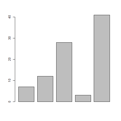
使用输入向量和每个条的名称创建一个简单的条形图。以下脚本将创建并保存当前 R 语言工作目录中的条形图。
# Create the data for the chart.
H <- c(7,12,28,3,41)

# Give the chart file a name.
png(file = "barchart.png")

# Plot the bar chart.
barplot(H)

# Save the file.
dev.off()
当我们执行上面的代码,它产生以下结果 -
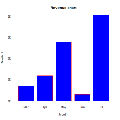
条形图标签,标题和颜色
可以通过添加更多参数来扩展条形图的功能。 主要参数用于添加标题。 col 参数用于向条形添加颜色。 name.args 是具有与输入向量相同数量的值的向量,以描述每个条的含义。
例
以下脚本将在当前R语言工作目录中创建并保存条形图。
# Create the data for the chart.
H <- c(7,12,28,3,41)
M <- c("Mar","Apr","May","Jun","Jul")

# Give the chart file a name.
png(file = "barchart_months_revenue.png")

# Plot the bar chart.
barplot(H,names.arg = M,xlab = "Month",ylab = "Revenue",col = "blue",
main = "Revenue chart",border = "red")

# Save the file.
dev.off()
当我们执行上面的代码,它产生以下结果 -
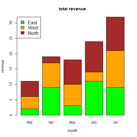
组合条形图和堆积条形图
我们可以使用矩阵作为输入值,在每个条中创建条形图和堆叠组的条形图。超过两个变量表示为用于创建组合条形图和堆叠条形图的矩阵。
# Create the input vectors.
colors <- c("green","orange","brown")
months <- c("Mar","Apr","May","Jun","Jul")
regions <- c("East","West","North")

# Create the matrix of the values.
Values <- matrix(c(2,9,3,11,9,4,8,7,3,12,5,2,8,10,11),nrow = 3,ncol = 5,byrow = TRUE)

# Give the chart file a name.
png(file = "barchart_stacked.png")

# Create the bar chart.
barplot(Values,main = "total revenue",names.arg = months,xlab = "month",ylab = "revenue",
   col = colors)

# Add the legend to the chart.
legend("topleft", regions, cex = 1.3, fill = colors)

# Save the file.
dev.off()
以上内容是否对您有帮助:


更多建议: