 免费 AI IDE
在之前的文章中小编介绍过matplotlib怎么画子图,但是有时候要把几张图放在一起进行对比,还需要共享坐标轴,那么matplotlib子图怎么共享坐标轴呢?接下来这篇文章告诉你。
分析
有时候想要把几张图放在一起plot,比较好对比,subplot和subplots都可以实现,具体对比可以查看参考博文。这里用matplotlib库的subplot来举个栗子。
数据长什么样
有两个数据段,第一个数据是DataFrame类型,第二个是ndarray类型。每个数据都有3列,我想画1*3的折线子图,第一个数据的第n列和第二个数据的第n列画在一张子图上。先来看一下两个数据长什么样儿(为显示方便,只看前5行)。
In [1]: testing_set.head()  # DataFrame类型
Out [1]:     Open    High     Low
		 0  778.81  789.63  775.80
		 1  788.36  791.34  783.16
		 2  786.08  794.48  785.02
		 3  795.26  807.90  792.20
		 4  806.40  809.97  802.83  # ndarray类型

In [2]: predicted_stock_price  #这里就只看前5行
Out [2]: [[790.6911  796.39215 779.3191 ]
 		 [790.24524 796.0866  778.9673 ]
 		 [789.5737  795.52606 778.3751 ]
		 [790.1047  796.10864 778.92395]
 		 [790.8686  796.94104 779.7281 ]]
实现过程
注:plt.setp()是用来共享y坐标轴
# 创建画布
fig = plt.figure(figsize = (30,10), dpi = 80)
# 子图1
ax1 = plt.subplot(131)
ax1.set_title('Open Price')
ax1.plot(testing_set.values[:,0], color = 'red', label = 'Real Open Price')
ax1.plot(predicted_stock_price[:,0], color = 'blue', label = 'Predicted Open Price')
plt.setp(ax1.get_xticklabels(), fontsize=6)
ax1.legend()
# 子图2
ax2 = plt.subplot(132,sharey=ax1)
ax2.set_title('High Price')
ax2.plot(testing_set.values[:,1], color = 'red', label = 'Real High Price')
ax2.plot(predicted_stock_price[:,1], color = 'blue', label = 'Predicted High Price')
ax2.legend()
# 子图3
ax3 = plt.subplot(133,sharey=ax1)
ax3.set_title('Low Price')
ax3.plot(testing_set.values[:,2], color = 'red', label = 'Real Low Price')
ax3.plot(predicted_stock_price[:,2], color = 'blue', label = 'Predicted Low Price')
ax3.legend()
plt.show()
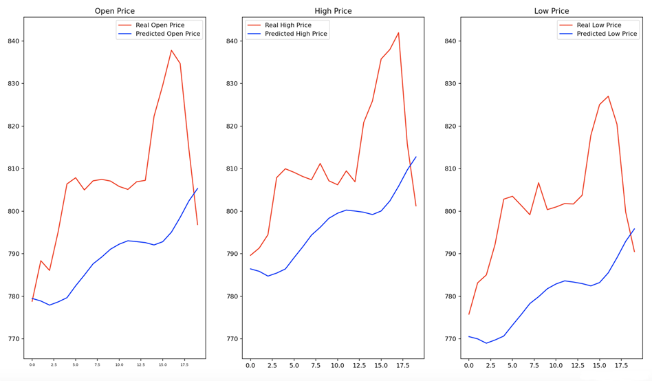
结果:
到此这篇matplotlib子图怎么共享坐标轴的文章就介绍到这了,更多matplotlib使用的文章请关注W3Cschool!