
 免费 AI IDE

styled-components Helper
createGlobalStyle v4仅网络
一个辅助函数来生成一个特殊的 StyledComponent处理全球风格。通常,样式化的组件会自动划分为本地CSS类的范围,因此会与其他组件隔离。如果是createGlobalStyle,此限制已消除,可以应用CSS重置或基本样式表之类的内容。
| 争论 | 描述 |
|---|---|
| 1。 TaggedTemplateLiteral | 带CSS和插值的带标记的模板文字。 |
返回一个 StyledComponent那不接受孩子。将其放在React树的顶部,并且在“渲染”组件时将注入全局样式。
import { createGlobalStyle } from 'styled-components'

const GlobalStyle = createGlobalStyle`
  body {
    color: ${props => (props.whiteColor ? 'white' : 'black')};
  }
`

// later in your app

<React.Fragment>
  <GlobalStyle whiteColor />
  <Navigation /> {/* example of other top-level stuff */}
</React.Fragment>
自从 全球风格 组件是一个 StyledComponent。
import { createGlobalStyle, ThemeProvider } from 'styled-components'

const GlobalStyle = createGlobalStyle`
  body {
    color: ${props => (props.whiteColor ? 'white' : 'black')};
    font-family: ${props => props.theme.fontFamily};
  }
`

// later in your app

<ThemeProvider theme={{ fontFamily: 'Helvetica Neue' }}>
  <React.Fragment>
    <Navigation /> {/* example of other top-level stuff */}
    <GlobalStyle whiteColor />
  </React.Fragment>
</ThemeProvider>
CSS
一个帮助函数,用于从带有插值的模板文字生成CSS。如果由于带标签的模板文字在JavaScript中的工作方式而返回的模板文字在插值内具有函数,则需要使用此函数。
如果要插入字符串,则仅在要插入函数时才需要使用它。
| 争论 | 描述 |
|---|---|
| 1。 TaggedTemplateLiteral | 带CSS和插值的带标记的模板文字。 |
返回一个插值数组,该数组是可以作为插值本身传递的扁平数据结构。
import styled, { css } from 'styled-components'

const complexMixin = css`
  color: ${props => (props.whiteColor ? 'white' : 'black')};
`

const StyledComp = styled.div`
  /* This is an example of a nested interpolation */
  ${props => (props.complex ? complexMixin : 'color: blue;')};
`
如果不使用css,您的功能将是 toString()ed,您将无法获得预期的结果。
关键帧 仅网络
为动画创建关键帧的辅助方法。
| 争论 | 描述 |
|---|---|
| 1。 TaggedTemplateLiteral | 带标记的模板文字,其中包含您的关键帧。 |
返回要在动画声明中使用的关键帧模型。您可以使用getName() 如果要获取生成的动画名称,请使用返回模型的API。
注意
在样式组件v3及以下版本中, 关键帧 帮助程序直接返回动画名称,而不是带有的对象 getName 方法。
import styled, { keyframes } from 'styled-components'

const fadeIn = keyframes`
  0% {
    opacity: 0;
  }
  100% {
    opacity: 1;
  }
`

const FadeInButton = styled.button`
  animation: 1s ${fadeIn} ease-out;
`
如果您将样式规则部分编写,请确保使用 的CSS 帮手。
import styled, { css, keyframes } from 'styled-components'

const pulse = keyframes`
  0% {
    opacity: 0;
  }
  100% {
    opacity: 1;
  }
`

const animation = props =>
  css`
    ${pulse} ${props.animationLength} infinite alternate;
  `

const PulseButton = styled.button`
  animation: ${animation};
`
StyleSheetManager
一个帮助程序组件,用于修改样式的处理方式。对于给定的涉及样式组件的子树,您可以自定义各种行为,例如CSS运行时处理器(stylis)如何通过userland插件和选项覆盖来处理样式。
| 道具 | 描述 |
|---|---|
| disableCSSOMInjection(v5 +) | 切换到较慢的基于文本节点的CSS注入系统,以向DOM添加样式。与未升级为使用CSSOM API的样式的第三方工具集成时非常有用。 |
| disableVendorPrefixes(v5 +) | 选择不给定的子树,为渲染的组件添加旧的CSS属性。 |
| 片 | 待在前面的巨龙。如果需要高级SSR方案,请创建并提供自己的StyleSheet。 |
| stylisPlugins(v5 +) | 在编译期间由stylis运行的一系列插件。查看npm上可用的内容。 |
| 目标 | 待在前面的巨龙。提供一个备用DOM节点以注入样式信息。 |
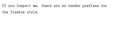
例如,如果您的应用仅在现代浏览器中运行,则您可能要禁用样式的供应商前缀:
// import styled, { StyleSheetManager } from 'styled-components'
const Box = styled.div`
  color: ${props => props.theme.color};
  display: flex;
`
render(
  <StyleSheetManager disableVendorPrefixes>
    <Box>If you inspect me, there are no vendor prefixes for the flexbox style.</Box>
  </StyleSheetManager>
)
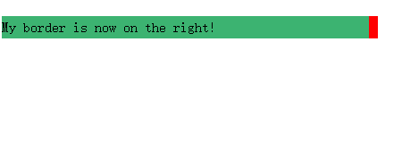
另一个示例是通过用户域为样式启用从右到左的翻译 stylis-plugin-rtl 插入:
// import styled, { StyleSheetManager } from 'styled-components'
// import stylisRTLPlugin from 'stylis-plugin-rtl';

const Box = styled.div`
  background: mediumseagreen;
  border-left: 10px solid red;
`

render(
  <StyleSheetManager stylisPlugins={[stylisRTLPlugin]}>
    <Box>My border is now on the right!</Box>
  </StyleSheetManager>
)
isStyledComponent
用于识别样式化组件的实用程序。
| 争论 | 描述 |
|---|---|
| 1。 功能 | 任何预期可能是样式化组件或包装在样式化组件中的React组件的函数 |
如果传递的函数是有效的样式化组件包装的组件类,则返回true。这对于确定是否需要包装组件以便可以用作组件选择器很有用:
import React from 'react'
import styled, { isStyledComponent } from 'styled-components'
import MaybeStyledComponent from './somewhere-else'

let TargetedComponent = isStyledComponent(MaybeStyledComponent)
  ? MaybeStyledComponent
  : styled(MaybeStyledComponent)``

const ParentComponent = styled.div`
  color: cornflowerblue;

  ${TargetedComponent} {
    color: tomato;
  }
`
isStyledComponent
用于识别样式化组件的实用程序。
| 争论 | 描述 |
|---|---|
| 1.功能 | 任何预期可能是样式化组件或包装在样式化组件中的React组件的函数 |
如果传递的函数是有效的样式化组件包装的组件类,则返回true。这对于确定是否需要包装组件以便可以用作组件选择器很有用:
import { withTheme } from 'styled-components'

class MyComponent extends React.Component {
  render() {
    console.log('Current theme: ', this.props.theme)
    // ...
  }
}

export default withTheme(MyComponent)
ThemeConsumer v4
这是由创建的“消费者”组件React.createContext 作为...的配套组件 主题提供者。它使用渲染道具模式来允许在渲染过程中动态访问主题。
它通过当前主题(基于 主题提供者作为子函数的参数。通过此函数,您可以返回进一步的JSX或不返回任何内容。
import { ThemeConsumer } from 'styled-components'
export default class MyComponent extends React.Component {
render() {
return (
<ThemeConsumer>
{theme => <div>The theme color is {theme.color}.</div>}
</ThemeConsumer>
)
}
}


更多建议: