
 免费 AI IDE
Flutter实战 组合现有组件
2025-10-13 18:07 更新
在 Flutter 中页面UI通常都是由一些低阶别的组件组合而成,当我们需要封装一些通用组件时,应该首先考虑是否可以通过组合其它组件来实现,如果可以,则应优先使用组合,因为直接通过现有组件拼装会非常简单、灵活、高效。
#示例:自定义渐变按钮
Flutter Material 组件库中的按钮默认不支持渐变背景,为了实现渐变背景按钮,我们自定义一个GradientButton组件,它需要支持一下功能:
- 背景支持渐变色
- 手指按下时有涟漪效果
- 可以支持圆角
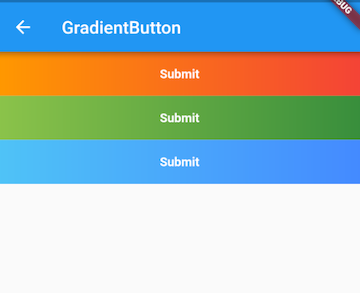
我们先来看看最终要实现的效果(图10-1):
我们DecoratedBox可以支持背景色渐变和圆角,InkWell在手指按下有涟漪效果,所以我们可以通过组合DecoratedBox和InkWell来实现GradientButton,代码如下:
import 'package:flutter/material.dart';


class GradientButton extends StatelessWidget {
  GradientButton({
    this.colors,
    this.width,
    this.height,
    this.onPressed,
    this.borderRadius,
    @required this.child,
  });


  // 渐变色数组
  final List<Color> colors;


  // 按钮宽高
  final double width;
  final double height;


  final Widget child;
  final BorderRadius borderRadius;


  //点击回调
  final GestureTapCallback onPressed;


  @override
  Widget build(BuildContext context) {
    ThemeData theme = Theme.of(context);


    //确保colors数组不空
    List<Color> _colors = colors ??
        [theme.primaryColor, theme.primaryColorDark ?? theme.primaryColor];


    return DecoratedBox(
      decoration: BoxDecoration(
        gradient: LinearGradient(colors: _colors),
        borderRadius: borderRadius,
      ),
      child: Material(
        type: MaterialType.transparency,
        child: InkWell(
          splashColor: _colors.last,
          highlightColor: Colors.transparent,
          borderRadius: borderRadius,
          onTap: onPressed,
          child: ConstrainedBox(
            constraints: BoxConstraints.tightFor(height: height, width: width),
            child: Center(
              child: Padding(
                padding: const EdgeInsets.all(8.0),
                child: DefaultTextStyle(
                  style: TextStyle(fontWeight: FontWeight.bold),
                  child: child,
                ),
              ),
            ),
          ),
        ),
      ),
    );
  }
}
可以看到GradientButton是由DecoratedBox、Padding、Center、InkWell等组件组合而成。当然上面的代码只是一个示例,作为一个按钮它还并不完整,比如没有禁用状态,读者可以根据实际需要来完善。
#使用GradientButton
import 'package:flutter/material.dart';
import '../widgets/index.dart';


class GradientButtonRoute extends StatefulWidget {
  @override
  _GradientButtonRouteState createState() => _GradientButtonRouteState();
}


class _GradientButtonRouteState extends State<GradientButtonRoute> {
  @override
  Widget build(BuildContext context) {
    return Container(
      child: Column(
        children: <Widget>[
          GradientButton(
            colors: [Colors.orange, Colors.red],
            height: 50.0,
            child: Text("Submit"),
            onPressed: onTap,
          ),
          GradientButton(
            height: 50.0,
            colors: [Colors.lightGreen, Colors.green[700]],
            child: Text("Submit"),
            onPressed: onTap,
          ),
          GradientButton(
            height: 50.0,
            colors: [Colors.lightBlue[300], Colors.blueAccent],
            child: Text("Submit"),
            onPressed: onTap,
          ),
        ],
      ),
    );
  }
  onTap() {
    print("button click");
  }
}#总结
通过组合的方式定义组件和我们之前写界面并无差异,不过在抽离出单独的组件时我们要考虑代码规范性,如必要参数要用@required 标注,对于可选参数在特定场景需要判空或设置默认值等。这是由于使用者大多时候可能不了解组件的内部细节,所以为了保证代码健壮性,我们需要在用户错误地使用组件时能够兼容或报错提示(使用assert断言函数)。
以上内容是否对您有帮助:


更多建议: