
 免费 AI IDE

Flex ToggleButtonBar控件
2018-01-01 18:59 更新
介绍
ToggleButtonBar控件提供了一组水平或垂直按钮,以保持其选定或取消选择的状态。
类声明
以下是 mx.controls.ToggleButtonBar 类的声明:
public class ToggleButtonBar
   extends ButtonBar
公共属性
| S.N. | 属性和描述 |
|---|---|
| 1 | selectedIndex:int [override]所选按钮的索引。 |
| 2 | toggleOnClick:Boolean 指定是否可以由用户取消选择当前选择的按钮。 |
公共方法
| S.N. | 方法和描述 |
|---|---|
| 1 | ToggleButtonBar() 构造函数。 |
继承的方法
此类继承以下类中的方法:
mx.controls.ButtonBar
mx.controls.NavBar
mx.containers.Box
mx.core.Container
mx.core.UIComponent
mx.core.FlexSprite
flash.display.Sprite
flash.display.DisplayObjectContainer
flash.display.InteractiveObject
flash.display.DisplayObject
flash.events.EventDispatcher
Object
Flex ToggleButtonBar控件示例
让我们按照以下步骤通过创建测试应用程序来检查Flex应用程序中ToggleButtonBar控件的用法:
| 步骤 | 描述 |
|---|---|
| 1 | 在 Flex - 创建应用程序章节中所述,在包 com.tutorialspoint.client 下创建名为 HelloWorld 的项目。 |
| 2 | 修改 HelloWorld.mxml ,如下所述。 保持文件的其余部分不变。 |
| 3 | 编译并运行应用程序,以确保业务逻辑按照要求工作。 |
以下是修改后的mxml文件 src / com.tutorialspoint / HelloWorld.mxml 的内容。
<?xml version="1.0" encoding="utf-8"?>
<s:Application xmlns:fx="http://ns.adobe.com/mxml/2009"
   xmlns:s="library://ns.adobe.com/flex/spark"
   xmlns:mx="library://ns.adobe.com/flex/mx"
   width="100%" height="100%" minWidth="500" minHeight="500"
   >
   <fx:Style source="/com/tutorialspoint/client/Style.css"/>
   <fx:Script>
      <![CDATA[
         import mx.events.ItemClickEvent;
         private function sectionClickHandler(event:ItemClickEvent):void {
            sectionContents.text = "Contents for " + event.label;
         }
      ]]>
   </fx:Script>
   <fx:Declarations>
      <fx:Array id="sectionList">
         <fx:String>Section 1</fx:String>
         <fx:String>Section 2</fx:String>
         <fx:String>Section 3</fx:String>
         <fx:String>Section 4</fx:String>
         <fx:String>Section 5</fx:String>
      </fx:Array>
   </fx:Declarations>
   <s:BorderContainer width="630" height="480" id="mainContainer"
      styleName="container">
      <s:VGroup width="100%" height="100%" gap="50"
         horizontalAlign="center" verticalAlign="middle">
         <s:Label id="lblHeader" text="Complex Controls Demonstration"
            fontSize="40" color="0x777777" styleName="heading"/>
            <s:Panel id="toggleButtonBarPanel" title="Using ToggleButtonBar"
               width="500" height="300" >
               <s:layout>
                  <s:VerticalLayout  gap="10" verticalAlign="middle"
                     horizontalAlign="center" paddingTop="10"/>
               </s:layout>
               <mx:ToggleButtonBar itemClick="sectionClickHandler(event);"
                  dataProvider="{sectionList}" />
               <s:BorderContainer width="90%" height="70%"
                  borderColor="0x323232">
                  <s:VGroup verticalAlign="middle"
                     horizontalAlign="center" width="100%" height="100%">
                     <s:Label id="sectionContents"
                        text="Contents for Section 1"/>
                  </s:VGroup>
               </s:BorderContainer>
            </s:Panel>
      </s:VGroup>
   </s:BorderContainer>
</s:Application>
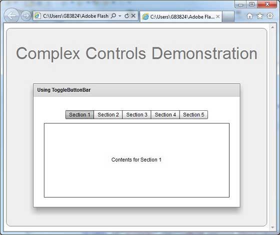
准备好所有更改后,让我们以正常模式编译和运行应用程序,就像在 Flex - 创建应用程序中一样 章节。 如果一切顺利,您的应用程序,这将产生以下结果:[在线试用]
以上内容是否对您有帮助:


更多建议: