
 免费 AI IDE

CSS 单位
CSS 单位
若您想让某个 HTML 元素在指定窗口显示出您所期望的样子,那么需要您为它设置 CSS 属性并为该属性指定一个具体的数值和单位,例如 width 属性,font-size 属性。
CSS 中定义了两种长度单位类型:
- 绝对单位( absolute )
- 相对单位( relative )
以下代码在属性中设置测量单位:
<!DOCTYPE HTML>
<html>
<head>
<style type="text/css">
p  {
    background: grey;
    color:white;
    width: 5cm;
    font-size:  20pt;
}
</style>
</head>
<body>
   <p>this is a test.</p>
</body>
</html>
要指定长度,请将数字和单位标识符连接在一起。
在上面的代码中,width 属性为 5cm 。 font-size (字体大小)属性为 20pt 。
绝对长度
这些单位是现实世界的测量单位。比如千米、米、厘米、毫米这样固定的单位就被称为绝对单位。
CSS 支持五种类型的绝对单位。
| 单位标识符 | 描述 |
|---|---|
| in | 英寸 |
| cm | 厘米 |
| mm | 毫米 |
| pt | 点或磅 (1 点 = 1/72 英寸) |
| pc | 12点活字 (1 pc = 12 pt) |
您可以在样式中混合和匹配单位,也可以混合绝对和相对单位。
您可以混合和匹配单位。
<!DOCTYPE HTML>
<html>
    <head>
        <style>
        p {
            width: 5cm;
            font-size: 20pt;
        }
        </style>
    </head>
    <body>
        <p>I like <span>HTML</span> and CSS. www.w3cschool.cn</p>
    </body>
</html>
注:
- 绝对单位在网页中很少使用,但在一些特殊场合使用绝对单位来解决问题还是很有必要的。
相对长度
相对单位会根据一个不固定的参照值来测量决定显示结果。比如:
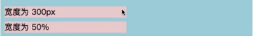

可以看到相对单位 % 根据父元素(蓝绿色框框)的宽决定了子元素的显示结果。而相对单位 px 保持不变。
CSS 定义了大范围的相对测量。
下表显示了 CSS 在主流浏览器中定义和支持的相对单位。
| 单位标识符 | 描述 |
|---|---|
| em | 相对于元素的字体大小 |
| ex | 相对于元素字体的“x-height” |
| rem | 相对于根元素的字体大小 |
| px | 许多 CSS 像素(假定在 96dpi 显示器上) |
| % | 另一个属性的值的百分比 |
在以下示例中,height 属性的值为 2em。 2em 意味着p元素的高度是字体大小的两倍。
<!DOCTYPE HTML>
<html>
    <head>
        <style>
        p {
            font-size: 15pt;
            height: 2em;
        }
        </style>
    </head>
    <body>
        <a href="https://www.w3cschool.cn">Visit the website</a>
        <p>I like <span>HTML</span> and CSS.</p>
        <p style="font-size:12pt">Font size 12pt.</p>
    </body>
</html>
例子
以下代码显示如何比较英寸和像素中的高度设置。
<html>
<head>
<title>Pixels to Inches</title>
<style type="text/css">
div {
background: #000;
border: 1px solid rgb(128, 128, 128);
color: white;
font: 9px monospace;
margin: 15px;
text-align: center;
}
div#inches {
width: 1in;
height: 1in;
}
div#pixels {
width: 96px;
height: 96px;
}
</style>
</head>
<body>
<div id="inches"><-- 1 Inch --></div>
<div id="pixels"><-- 96 Pixels --></div>
</body>
</html>
像素值
一个容易设置的长度是使用像素值。1 像素是 1/96 英寸。以下代码设置字体大小和宽度的像素值。
<!DOCTYPE HTML>
<html>
    <head>
        <style type="text/css">
        p {
            background: grey;
            color:white;
            font-size: 20px;
            width: 200px;
        }
        </style>
    </head>
    <body>
        <a href="https://www.w3cschool.cn">Visit the website</a>
        <p>I like <span>HTML</span> and CSS.</p>
    </body>
</html>
百分比值
您可以将度量单位表示为另一个属性值的百分比。您可以使用 %(百分比)单位。
<!DOCTYPE HTML>
<html>
    <head>
        <style type="text/css">
        p {
            background: grey;
            color:white;
            font-size: 200%;
            width: 50%;
        }
        </style>
    </head>
    <body>
        <a href="https://www.w3cschool.cn">Visit the website</a>
        <p>I like <span>HTML</span> and CSS.</p>
    </body>
</html>
百分比值的一个很好的功能是,当您调整浏览器窗口的大小时,值正在更新。
相对于字体大小
以下代码使用相对单位。
<!DOCTYPE HTML>
<html>
<head>
<style type="text/css">
p  {
    background: grey;
    color:white;
    font-size:  15pt;
    height: 2em;
}
</style>
</head>
<body>
    <p>This is a test.</p>
    <p style="font-size:12pt">This is another test.</p>
</body>
</html>
上面的代码将height属性设置为 2em ,这意味着 p元素的高度是字体大小的两倍。
第一个 p 元素的字体大小为15pt。第二个 p 元素的 font-size 为12pt。
派生自其他相对值
您可以使用相对单位来表示另一个相对度量的倍数。
以下示例显示 height 属性以 em 单位表示。 em 单位派生自 font-size 属性的值,其使用 rem 单位表示。
<!DOCTYPE HTML>
<html>
<head>
<style type="text/css">
html  {
    font-size: 0.2in;
}
p  {
    background: grey;
    color:white;
    font-size:  2rem;
    height: 2em;
}
</style>
</head>
<body style="font-size:14pt">
   <a href="https://www.w3cschool.cn">website</a>
   <p>This is a test.</p>
   <a href="https://link.w3cschool.cn/?target=https%3A%2F%2Fw3.org" rel="external nofollow" target="_blank" >W3C</a>
</body>
</html>
上述示例分配的绝对字体大小为 0.2 英寸。
rem 单位是相对于字体大小的 HTML 元素,也称为根元素。
font-size 值 2rem 意味着字体大小将是根元素字体 0.4 英寸的大小的两倍。
相同样式中的 height 属性被指定为 2em,这是再次的两倍。这意味着浏览器将使用高度为0.4英寸的字体显示 p 元素,并且整体元素将为 0.8 英寸高。
另一个与字体相关的相对单位是 ex , 1ex 大约为 0.5em 。
像素
主流浏览器将 1 个像素视为 1/96 英寸。
下面的代码演示了如何指定 CSS 样式中的像素。
<!DOCTYPE HTML>
<html>
<head>
<style type="text/css">
p  {
    background: grey;
    color:white;
    font-size:  20px;
    width:  200px;
}
</style>
</head>
<body>
   <p>This is a test.</p>

</body>
</html>
px 单位更灵活。你只需要改变字体的大小,其余的风格无缝地工作。
百分比
您可以将度量单位表示为另一个属性值的百分比。
您可以使用%(百分比)单位。
以下代码将单位表示为另一个属性值的百分比。
<!DOCTYPE HTML>
<html>
<head>
<style type="text/css">
p {
    background: grey;
    color:white;
    font-size: 200%;
    width: 50%;
}
</style>
</head>
<body>
    <a href="https://www.w3cschool.cn">website</a>
    <p>this is a test.</p>
    <a href="https://link.w3cschool.cn/?target=https%3A%2F%2Fw3.org" rel="external nofollow" target="_blank" >W3C</a>
</body>
</html>


更多建议: