


径向渐变
语法:
background:radial-gradient(
center,shape,size,star- color,...
)
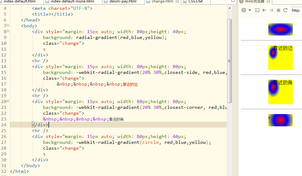
样式一:
默认方式以中心角开始到最远角。
 <!DOCTYPE html>
<html>
<head>
<meta charset="UTF-8">
<title></title>
</head>
<body>
<!DOCTYPE html>
<html>
<head>
<meta charset="UTF-8">
<title></title>
</head>
<body>
<div style="margin: 15px auto; width: 80px;height: 40px;
background: radial-gradient(red,blue,yellow);
class="change">
s
</div>
<hr />
<div style="margin: 15px auto; width: 80px;height: 80px;
background: -webkit-radial-gradient(20% 30%,closest-side, red,blue,yellow);
class="change">
靠近的边
</div>
<hr />
<div style="margin: 15px auto; width: 80px;height: 80px;
background: -webkit-radial-gradient(20% 30%,closest-corner, red,blue,yellow);
class="change">
靠近的角
</div>
<hr />
<div style="margin: 15px auto; width: 80px;height: 40px;
background: -webkit-radial-gradient(circle, red,blue,yellow);
class="change">
s
</div>
</body>
</html>

更多建议: