
 免费 AI IDE

Bootstrap5 信息提示框
2023-06-21 15:07 更新
Bootstrap 5 可以很容易实现信息提示框。
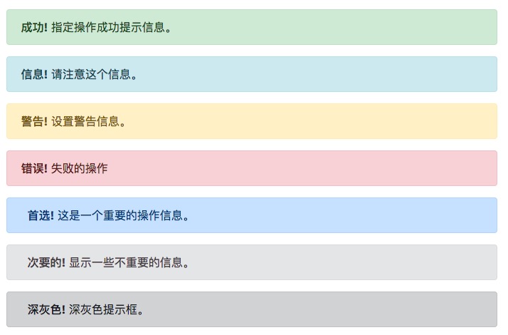
提示框可以使用 .alert 类, 后面加上 .alert-success, .alert-info, .alert-warning, .alert-danger, .alert-primary, .alert-secondary, .alert-light 或 .alert-dark 类来实现:
<!DOCTYPE html>
<html>
<head>
  <title>Bootstrap5 实例</title>
  <meta charset="utf-8">
  <meta name="viewport" content="width=device-width, initial-scale=1">
  <link href="https://link.w3cschool.cn/?target=https%3A%2F%2Fcdn.staticfile.org%2Ftwitter-bootstrap%2F5.1.1%2Fcss%2Fbootstrap.min.css" rel="external nofollow" target="_blank"  rel="stylesheet">
  <script src="https://cdn.staticfile.org/twitter-bootstrap/5.1.1/js/bootstrap.bundle.min.js" rel="external nofollow"  rel="external nofollow"  rel="external nofollow"  rel="external nofollow" ></script>
</head>
<body>

<div class="container mt-3">
  <h2>提示框</h2>
  <p>提示框可以使用 .alert 类, 后面加上指定特定意义的颜色类来实现:</p>
  <div class="alert alert-success">
    <strong>成功!</strong> 指定操作成功提示信息。
  </div>
  <div class="alert alert-info">
    <strong>信息!</strong> 请注意这个信息。
  </div>
  <div class="alert alert-warning">
    <strong>警告!</strong> 设置警告信息。
  </div>
  <div class="alert alert-danger">
    <strong>错误!</strong> 失败的操作
  </div>
  <div class="alert alert-primary">
    <strong>首选!</strong> 这是一个重要的操作信息。
  </div>
  <div class="alert alert-secondary">
    <strong>次要的!</strong> 显示一些不重要的信息。
  </div>
  <div class="alert alert-dark">
    <strong>深灰色!</strong> 深灰色提示框。
  </div>
  <div class="alert alert-light">
    <strong>浅灰色!</strong>浅灰色提示框。
  </div>
</div>

</body>
</html>提示框添加链接
提示框中在链接的标签上添加 alert-link 类来设置匹配提示框颜色的链接:
<!DOCTYPE html>
<html>
<head>
  <title>Bootstrap5 实例</title>
  <meta charset="utf-8">
  <meta name="viewport" content="width=device-width, initial-scale=1">
  <link href="https://link.w3cschool.cn/?target=https%3A%2F%2Fcdn.staticfile.org%2Ftwitter-bootstrap%2F5.1.1%2Fcss%2Fbootstrap.min.css" rel="external nofollow" target="_blank"  rel="stylesheet">
  <script src="https://cdn.staticfile.org/twitter-bootstrap/5.1.1/js/bootstrap.bundle.min.js" rel="external nofollow"  rel="external nofollow"  rel="external nofollow"  rel="external nofollow" ></script>
</head>
<body>

<div class="container mt-3">
  <h2>提示框添加链接</h2>
  <p>提示框中在链接的标签上添加 alert-link 类来设置匹配提示框颜色的链接:</p>
  <div class="alert alert-success">
    <strong>成功!</strong> 你应该认真阅读 <a href="#" class="alert-link">这条信息</a>。
  </div>
  <div class="alert alert-info">
    <strong>信息!</strong> 你应该认真阅读 <a href="#" class="alert-link">这条信息</a>。
  </div>
  <div class="alert alert-warning">
    <strong>警告!</strong> 你应该认真阅读 <a href="#" class="alert-link">这条信息</a>。
  </div>
  <div class="alert alert-danger">
    <strong>错误!</strong> 你应该认真阅读 <a href="#" class="alert-link">这条信息</a>。
  </div>
  <div class="alert alert-primary">
    <strong>首选!</strong> 你应该认真阅读 <a href="#" class="alert-link">这条信息</a>。
  </div>
  <div class="alert alert-secondary">
    <strong>次要的!</strong> 你应该认真阅读 <a href="#" class="alert-link">这条信息</a>。
  </div>
  <div class="alert alert-dark">
    <strong>深灰色!</strong>你应该认真阅读 <a href="#" class="alert-link">这条信息</a>。
  </div>
  <div class="alert alert-light">
    <strong>灰色!</strong> 你应该认真阅读 <a href="#" class="alert-link">这条信息</a>。
  </div>
</div>

</body>
</html>关闭提示框
我们可以在提示框中的 div 中添加 .alert-dismissible 类,然后在关闭按钮的链接上添加 class="btn-close" 和 data-bs-dismiss="alert" 类来设置提示框的关闭操作。
<!DOCTYPE html>
<html>
<head>
  <title>Bootstrap5 实例</title>
  <meta charset="utf-8">
  <meta name="viewport" content="width=device-width, initial-scale=1">
  <link href="https://link.w3cschool.cn/?target=https%3A%2F%2Fcdn.staticfile.org%2Ftwitter-bootstrap%2F5.1.1%2Fcss%2Fbootstrap.min.css" rel="external nofollow" target="_blank"  rel="stylesheet">
  <script src="https://cdn.staticfile.org/twitter-bootstrap/5.1.1/js/bootstrap.bundle.min.js" rel="external nofollow"  rel="external nofollow"  rel="external nofollow"  rel="external nofollow" ></script>
</head>
<body>

<div class="container mt-3">
  <h2>关闭提示框</h2>
  <p>我们可以在提示框中的 div 中添加 .alert-dismissible 类,然后在关闭按钮的链接上添加 class="btn-close" 和 data-bs-dismiss="alert" 类来设置提示框的关闭操作。</p>
  <div class="alert alert-success alert-dismissible">
    <button type="button" class="btn-close" data-bs-dismiss="alert"></button>
    <strong>成功!</strong> 指定操作成功提示信息。
  </div>
  <div class="alert alert-info alert-dismissible">
    <button type="button" class="btn-close" data-bs-dismiss="alert"></button>
    <strong>信息!</strong> 请注意这个信息。
  </div>
  <div class="alert alert-warning alert-dismissible">
    <button type="button" class="btn-close" data-bs-dismiss="alert"></button>
    <strong>警告!</strong> 设置警告信息。
  </div>
  <div class="alert alert-danger alert-dismissible">
    <button type="button" class="btn-close" data-bs-dismiss="alert"></button>
    <strong>错误!</strong> 失败的操作。
  </div>
  <div class="alert alert-primary alert-dismissible">
    <button type="button" class="btn-close" data-bs-dismiss="alert"></button>
    <strong>首选!</strong> 这是一个重要的操作信息。
  </div>
  <div class="alert alert-secondary alert-dismissible">
    <button type="button" class="btn-close" data-bs-dismiss="alert"></button>
    <strong>次要的!</strong> 显示一些不重要的信息。
  </div>
  <div class="alert alert-dark alert-dismissible">
    <button type="button" class="btn-close" data-bs-dismiss="alert"></button>
    <strong>深灰色!</strong> 深灰色提示框。
  </div>
  <div class="alert alert-light alert-dismissible">
    <button type="button" class="btn-close" data-bs-dismiss="alert"></button>
    <strong>浅灰色!</strong>浅灰色提示框。
  </div>
</div>

</body>
</html>提示框动画
.fade 和 .show 类用于设置提示框在关闭时的淡出和淡入效果:
<!DOCTYPE html>
<html>
<head>
  <title>Bootstrap5 实例</title>
  <meta charset="utf-8">
  <meta name="viewport" content="width=device-width, initial-scale=1">
  <link href="https://link.w3cschool.cn/?target=https%3A%2F%2Fcdn.staticfile.org%2Ftwitter-bootstrap%2F5.1.1%2Fcss%2Fbootstrap.min.css" rel="external nofollow" target="_blank"  rel="stylesheet">
  <script src="https://cdn.staticfile.org/twitter-bootstrap/5.1.1/js/bootstrap.bundle.min.js" rel="external nofollow"  rel="external nofollow"  rel="external nofollow"  rel="external nofollow" ></script>
</head>
<body>

<div class="container mt-3">
  <h2>提示框动画</h2>
  <p>.fade 和 .show 类用于设置提示框在关闭时的淡出和淡入效果:</p>
  <div class="alert alert-success alert-dismissible fade show">
    <button type="button" class="btn-close" data-bs-dismiss="alert"></button>
    <strong>成功!</strong> 指定操作成功提示信息。
  </div>
  <div class="alert alert-info alert-dismissible fade show">
    <button type="button" class="btn-close" data-bs-dismiss="alert"></button>
    <strong>信息!</strong> 请注意这个信息。
  </div>
  <div class="alert alert-warning alert-dismissible fade show">
    <button type="button" class="btn-close" data-bs-dismiss="alert"></button>
    <strong>警告!</strong> 设置警告信息。
  </div>
  <div class="alert alert-danger alert-dismissible fade show">
    <button type="button" class="btn-close" data-bs-dismiss="alert"></button>
    <strong>错误!</strong> 失败的操作。
  </div>
  <div class="alert alert-primary alert-dismissible fade show">
    <button type="button" class="btn-close" data-bs-dismiss="alert"></button>
    <strong>首选!</strong> 这是一个重要的操作信息。
  </div>
  <div class="alert alert-secondary alert-dismissible fade show">
    <button type="button" class="btn-close" data-bs-dismiss="alert"></button>
    <strong>次要的!</strong> 显示一些不重要的信息。
  </div>
  <div class="alert alert-dark alert-dismissible fade show">
    <button type="button" class="btn-close" data-bs-dismiss="alert"></button>
    <strong>深灰色!</strong> 深灰色提示框。
  </div>
  <div class="alert alert-light alert-dismissible fade show">
    <button type="button" class="btn-close" data-bs-dismiss="alert"></button>
    <strong>浅灰色!</strong>浅灰色提示框。
  </div>
</div>

</body>
</html>以上内容是否对您有帮助:


更多建议: