免费 AI IDE
在前段开发中,我们都可以了解到什么是Bootstrap,那么今天我们就来说说有关于 Bootstrap响应式布局原理这个问题吧!下面是小编整理的相关内容,希望对大家的学习和了解有所帮助。
首先我们需要了解这个框架的实现原理,它是通过定义容器大小来平分的,然后在通过对内外边距,之后在通过我们的媒体查询就可以里,这样我们就完成了个强大的响应性网格系统。
一、栅格系统的工作原理:
1、在这个系统中我们的行(row)必须包含在我们的固定宽(.container)或者满屏宽度即宽度达到100%,这样可以方便我们为其添加合适的排列(aligment)和内补(padding)。
2、通过行(row)的特点我们可以在水平方向创建一组列(column)。
3、我们在使用的时候内容需要放置在列(column)中,而且只有列(column)才可以作为我们行(row)的直接子元素。
4、对于 .row和col-xs-4这种类的话我们是可以用来快速创建栅格布局的,不仅如此在bootstrap源码中定义的mixin也可以用来创建语义化布局。
5、在这是用这个布局的时候我们还可以通过设置padding属性。从而创建列和列之间的间隔(gutter),然后再通过.rowd的元素设置负值从而来抵消.container元素设置的padding,这个方法也就间接的为行(row)所包含的列(column)抵消掉padding。
6、如果这个系统的列是指定1到12的值从而来表示跨越范围。
7、系统中如果我们在进行设置的时候,如果一行(row)中包含了的列(column)大于12,多余的列所在的元素将作为一个整体另起一行排列。
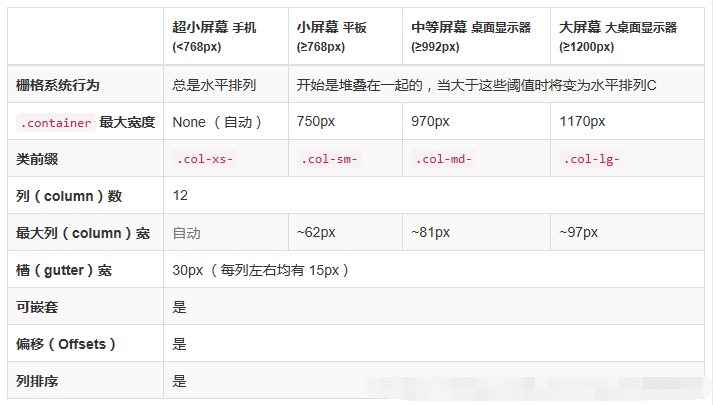
8、适用于与屏幕宽度大于或等于分界点大小的设备截图如下所示:
二、使用Bootstrap响应式布局
首先我们在新的页面中添加下面这些代码,如下所示:
<meta name="viewport" content="width=device-width, initial-scale=1, maximum-scale=1, user-scalable=no">
<link rel="stylesheet" type="text/css" href="/stylesheets/bootstrap.min.css">我们通过代码中可以知道,我们在mate标签中添加viewpirt属性,content中宽度等于设备宽度, initial-scale:页面首次被显示可见区域的缩放级别,取值1则页面按实际尺寸显示,无任何缩放;maximum-scale:允许用户缩放到的最小比例;user-scalable:用户是否可以手动缩放。
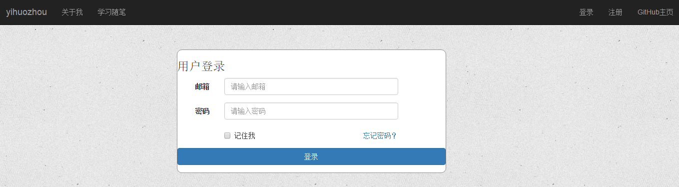
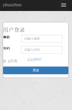
我们根据这个系统来看下面的代码和运行结果:
<div class="container-fluid login">
  <div class="row">
    <div class="col-xs-12 col-sm-12 col-md-8 col-lg-5 col-lg-offset-3">
      <form class="form-horizontal loginForm">
        <h3 class="form-signin-heading">用户登录</h3>
        <div class="form-group">
          <label for="email" class="col-sm-2 col-xs-3 control-label">邮箱</label>
          <div class="col-sm-8 col-xs-8">
            <input type="text" class="form-control" name="email" placeholder="请输入邮箱">
              <span class="glyphicon glyphicon-ok form-control-feedback" aria-hidden="true"></span>
            </div>
        </div>
        <div class="form-group">
          <label for="password" class="col-sm-2 col-xs-3 control-label">密码</label>
          <div class="col-sm-8 col-xs-8">
            <input type="password" class="form-control" name="password" placeholder="请输入密码">
              <span class="glyphicon glyphicon-ok form-control-feedback" aria-hidden="true"></span>
            </div>
        </div>
        <div class="form-group">
          <div class="col-sm-offset-2 col-sm-4 col-xs-4 ">
            <div class="checkbox">
              <label>
                <input type="checkbox">记住我 </label>
            </div>
          </div>
          <div class="col-sm-4 col-xs-4 control-label" >
            <a href="resetPwd.html" id="forget">忘记密码?</a>
          </div>
        </div>
        <div class="form-group">
          <div class="col-sm-12 col-lg-12">
            <button type="button" class="btn btn-primary btn-block" id="submit">登录</button>
          </div>
        </div>
      </form>
    </div>
  </div>
运行截图:
Bootstrap响应式布局PC端运行截图:
Bootstrap响应式布局手机端运行截图:
总结:
以上就是有关于“ Bootstrap响应式布局原理分享! ”的相关内容,如果你有不同看法也可以提出来和大家一同解决,更多有关于bootstrap中的相关内容和知识我们都可以在W3cschool中学习和了解!