


CSS3 动画
2018-10-27 11:49 更新
我们可以使用CSS动画动画转换从一个CSS样式配置到另一个。
动画由三部分组成:
- 一个描述CSS动画的样式
- 一组指示动画样式的开始和结束状态的关键帧
- 可能的中途航点。
配置动画
要创建CSS动画序列,我们使用动画缩写属性或其他动画相关属性对元素进行样式化。
我们可以配置动画的时间和持续时间,以及动画序列应该如何进展的其他细节。
动画的实际外观是使用 @keyframes 规则完成的。
下表列出了 @keyframes 规则和所有动画属性:
- @keyframes - 配置动画
- animation - 设置所有动画属性的缩写属性,除了animation-play-state和animation-fill-mode属性
- animation-delay - 当动画开始时设置
- animation-direction - 设置动画是否应该在交替循环中反向播放
- animation-duration - 设置动画完成一个周期所需的秒数或毫秒数
- animation-fill-mode - 设置当动画完成或延迟时使用的样式
- animation-iteration-count - 设置动画播放的次数
- animation-name - 设置@keyframes动画的名称
- animation-play-state - 设置动画是否正在运行或暂停
- animation-timing-function - 设置动画的速度曲线
例子
此示例显示如何使用CSS动画来创建 H1 元素在页面上移动。
<!doctype html>
<html>
<head>
  <style type="text/css">
    h1 {
      -moz-animation-duration: 3s;
      -webkit-animation-duration: 3s;
      -moz-animation-name: slidein;
      -webkit-animation-name: slidein;
    }

    @-moz-keyframes slidein {
      from {
        margin-left:100%;
        width:300%
      }
      to {
        margin-left:0%;
        width:100%;
      }
    }
    @-webkit-keyframes slidein {
      from {
        margin-left:100%;
        width:300%
      }

      to {
        margin-left:0%;
        width:100%;
      }
    }
  </style>
</head>
<body>
  <h1>Watch me move</h1>
</body>
</html>
例2
此示例显示如何使用CSS动画来创建 H1 元素在页面上移动并放大文本大小。
<!doctype html>
<html>
<head>
  <title>CSS animations: Example 2</title>
  <style type="text/css">
    h1 {
      -moz-animation-duration: 3s;
      -webkit-animation-duration: 3s;
      -moz-animation-name: slidein;
      -webkit-animation-name: slidein;
    }

    @-moz-keyframes slidein {
      from {
        margin-left:100%;
        width:300%
      }

      75% {
        font-size:300%;
        margin-left:25%;
        width:150%;
      }

      to {
        margin-left:0%;
        width:100%;
      }
    }

    @-webkit-keyframes slidein {
      from {
        margin-left:100%;
        width:300%
      }

      75% {
        font-size:300%;
        margin-left:25%;
        width:150%;
      }

      to {
        margin-left:0%;
        width:100%;
      }
    }
  </style>
</head>
<body>
  <h1>Watch me move</h1>

</body>
</html>
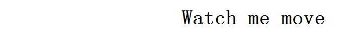
制作重复的动画
为了使动画重复,请使用 animation-iteration-count 属性以指示重复动画的次数。
以下代码使用infinite使动画重复无限:
<!doctype html>
<html>
<head>
  <title>CSS animations: Example 3</title>
  <style type="text/css">
    h1 {
      -moz-animation-duration: 3s;
      -webkit-animation-duration: 3s;
      -moz-animation-name: slidein;
      -webkit-animation-name: slidein;
      -moz-animation-iteration-count: infinite;
      -webkit-animation-iteration-count: infinite;
    }

    @-moz-keyframes slidein {
      from {
        margin-left:100%;
        width:300%
      }

      75% {
        font-size:300%;
        margin-left:25%;
        width:150%;
      }

      to {
        margin-left:0%;
        width:100%;
      }
    }

    @-webkit-keyframes slidein {
      from {
        margin-left:100%;
        width:300%
      }

      75% {
        font-size:300%;
        margin-left:25%;
        width:150%;
      }

      to {
        margin-left:0%;
        width:100%;
      }
    }

  </style>
</head>
<body>
  <h1>Watch me move</h1>
</body>
</html>
上面的代码呈现如下:
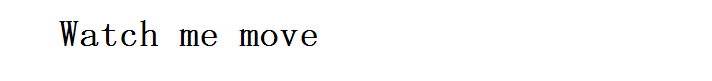
来回移动
要在屏幕上来回移动,我们可以将 animation-direction 设置为 alternate 。
<!doctype html>
<html>
<head>
  <title>CSS animations: Example 4</title>
  <style type="text/css">
    h1 {
      -moz-animation-duration: 3s;
      -webkit-animation-duration: 3s;
      -moz-animation-name: slidein;
      -webkit-animation-name: slidein;
      -moz-animation-iteration-count: infinite;
      -webkit-animation-iteration-count: infinite;
      -moz-animation-direction: alternate;
      -webkit-animation-direction: alternate;
    }

    @-moz-keyframes slidein {
      from {
        margin-left:100%;
        width:300%
      }

      75% {
        font-size:300%;
        margin-left:25%;
        width:150%;
      }

      to {
        margin-left:0%;
        width:100%;
      }
    }

    @-webkit-keyframes slidein {
      from {
        margin-left:100%;
        width:300%
      }

      75% {
        font-size:300%;
        margin-left:25%;
        width:150%;
      }

      to {
        margin-left:0%;
        width:100%;
      }
    }

  </style>
</head>
<body>
  <h1>Watch me move</h1>
</body>
</html>
上面的代码呈现如下:
相关属性
| 属性 | 描述 | 描述... |
|---|---|---|
| animation-delay | 动画开始时设置 | 3 |
| animation-direction | 在交替循环上反向播放动画 | 3 |
| animation-duration | 在一个周期中为动画设置持续时间(秒)或毫秒(ms) | 3 |
| animation-fill-mode | 设置动画使用的值不播放 | 3 |
| animation-iteration-count | 设置播放动画的次数 | 3 |
| animation-name | 设置@keyframes动画的名称 | 3 |
| animation-play-state | 运行或暂停动画 | 3 |
| animation-timing-function | 设置动画的速度曲线 | 3 |
| animation | 所有动画属性的速记属性 | 3 |
| @keyframes | 创建动画的关键帧 | 3 |
以上内容是否对您有帮助:
← CSS3 过渡

更多建议: